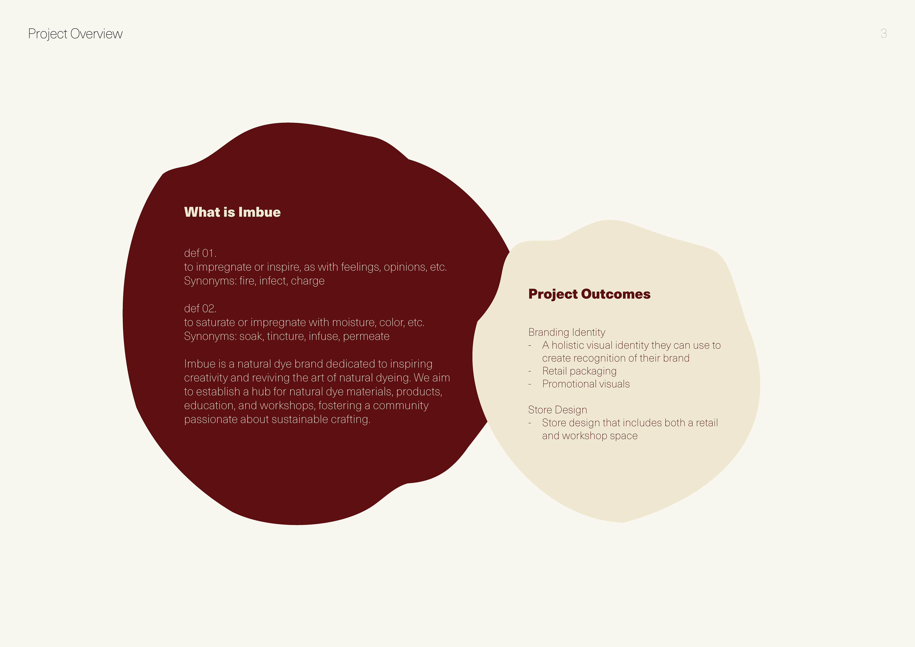
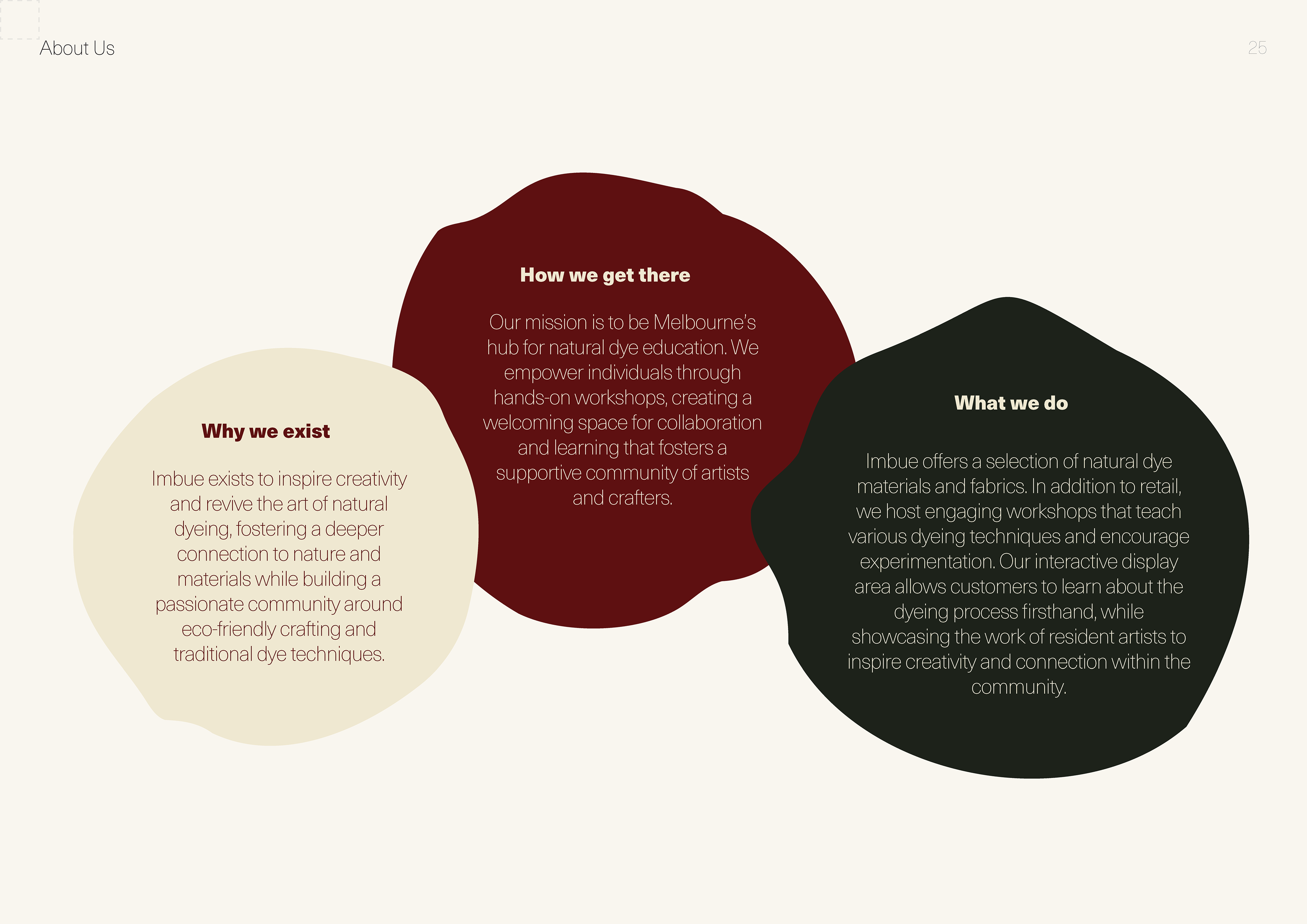
What.
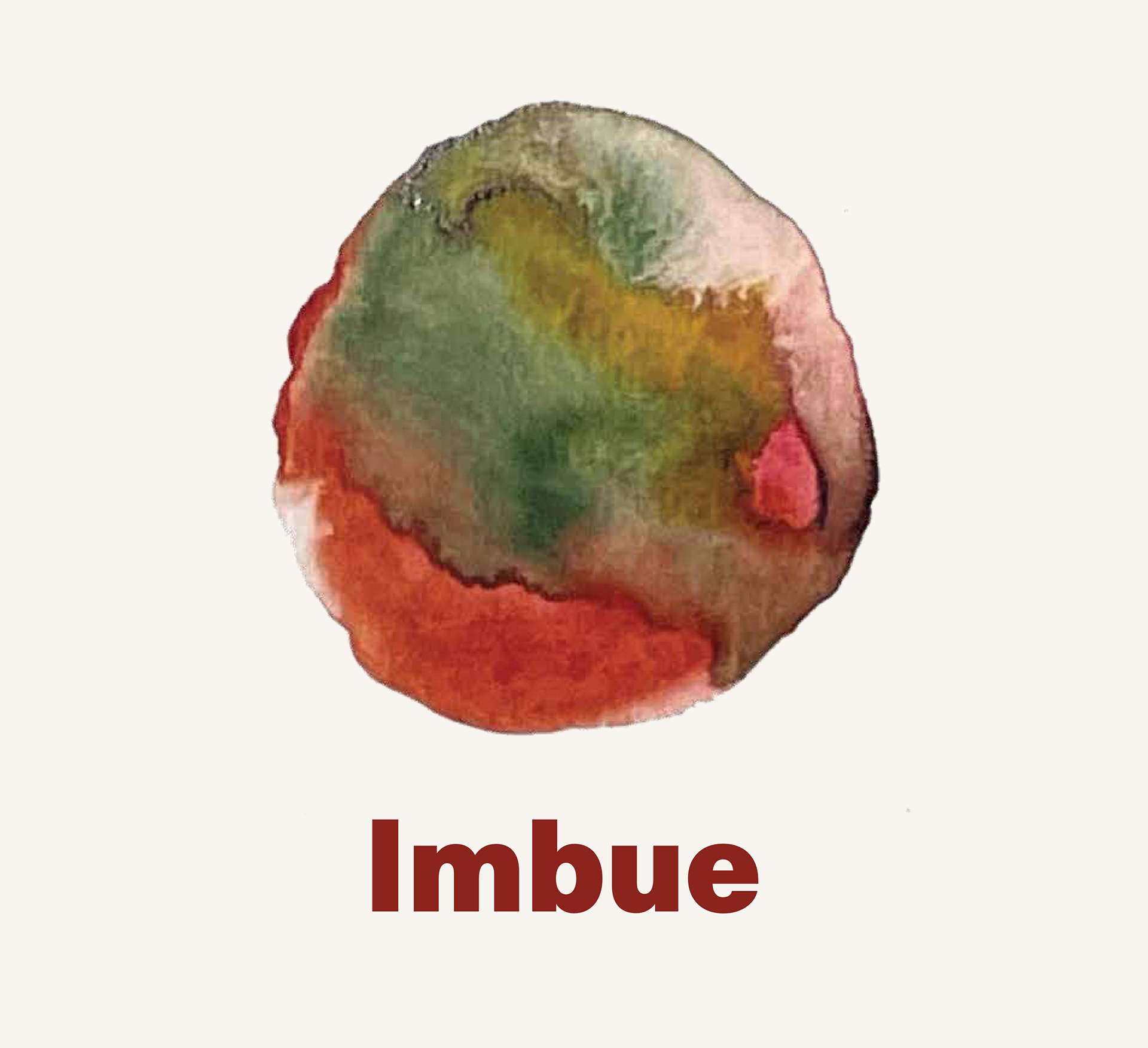
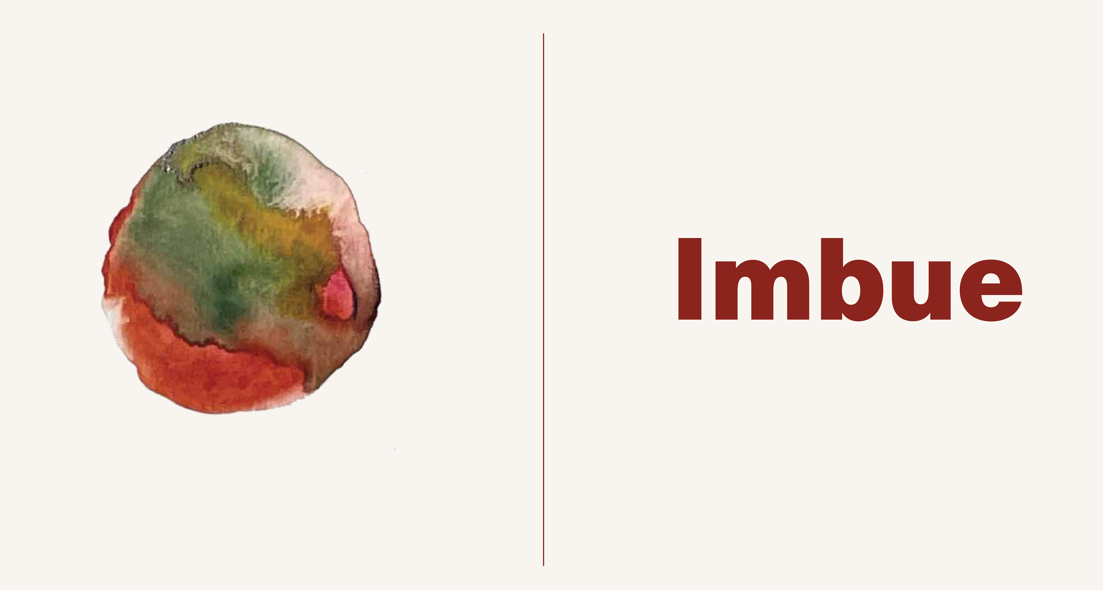
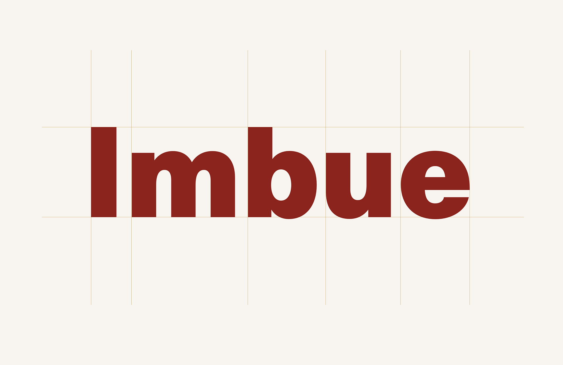
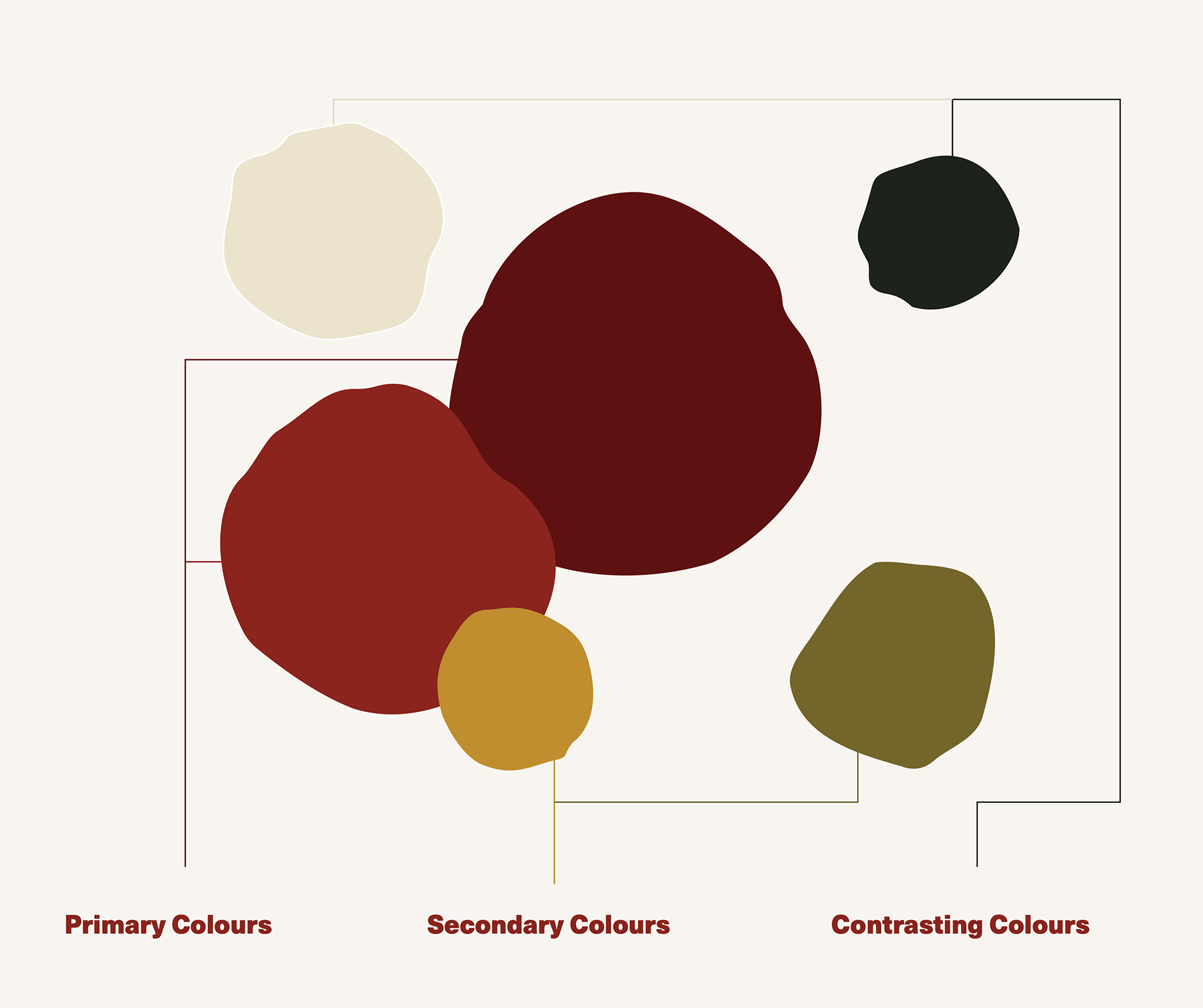
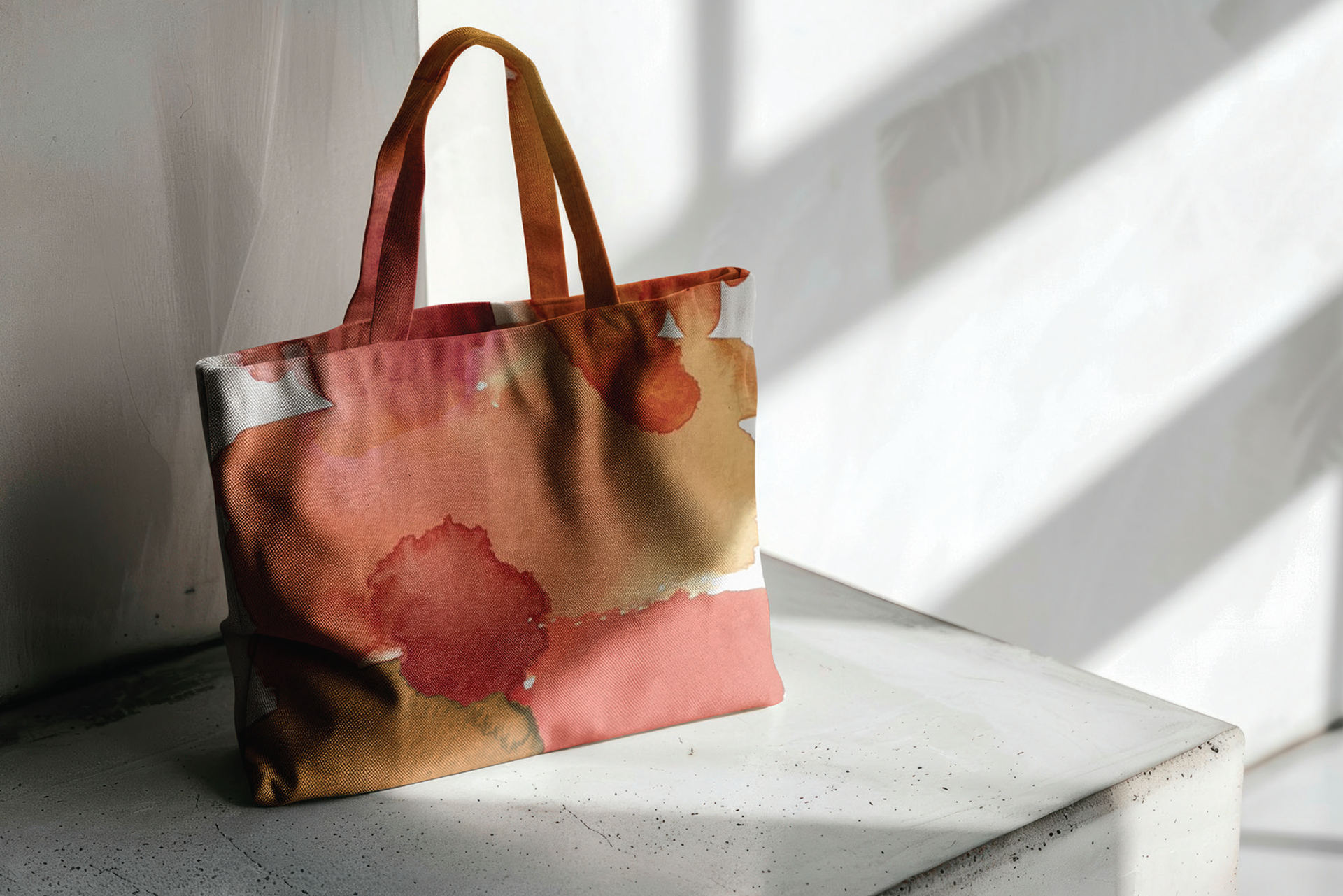
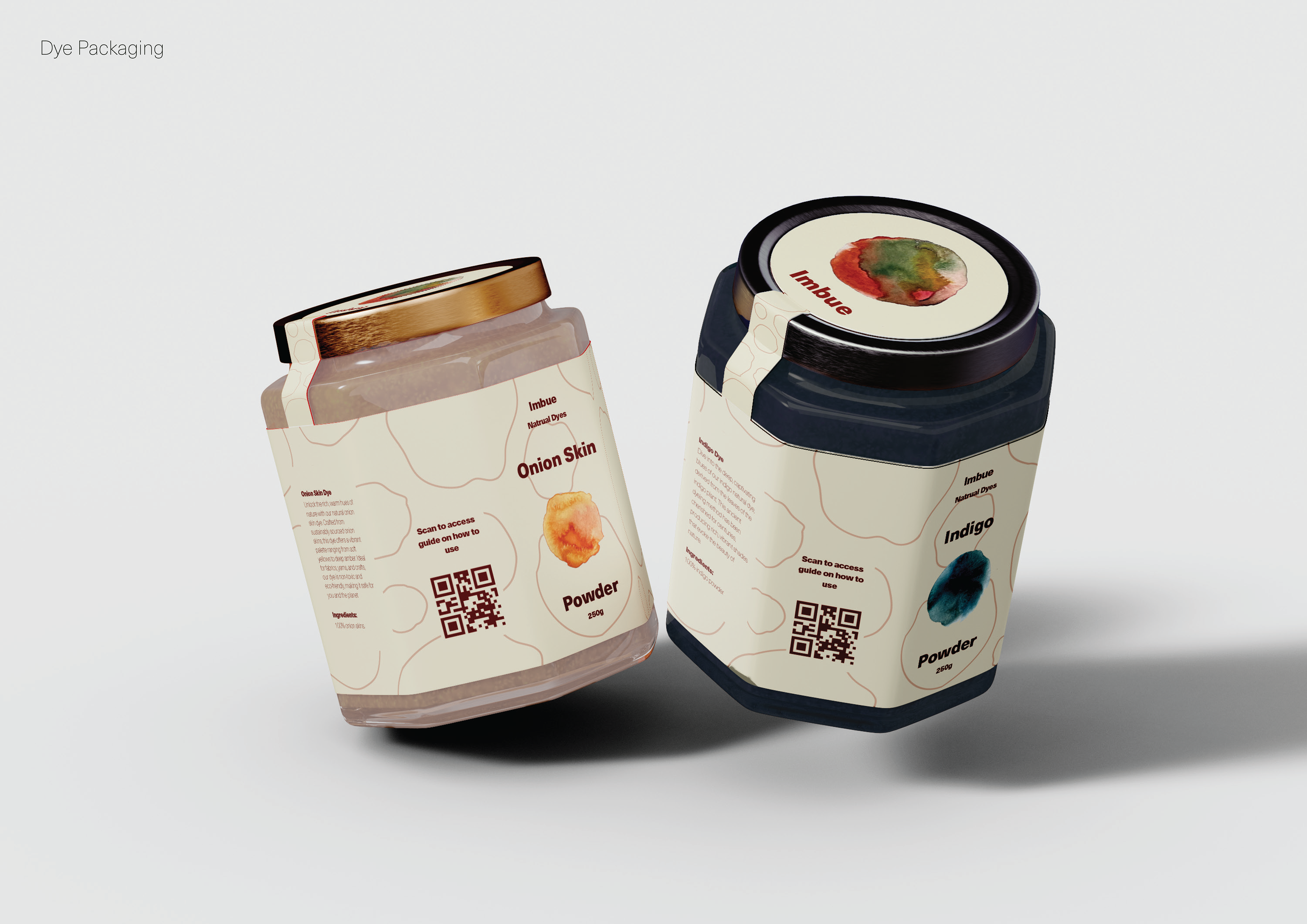
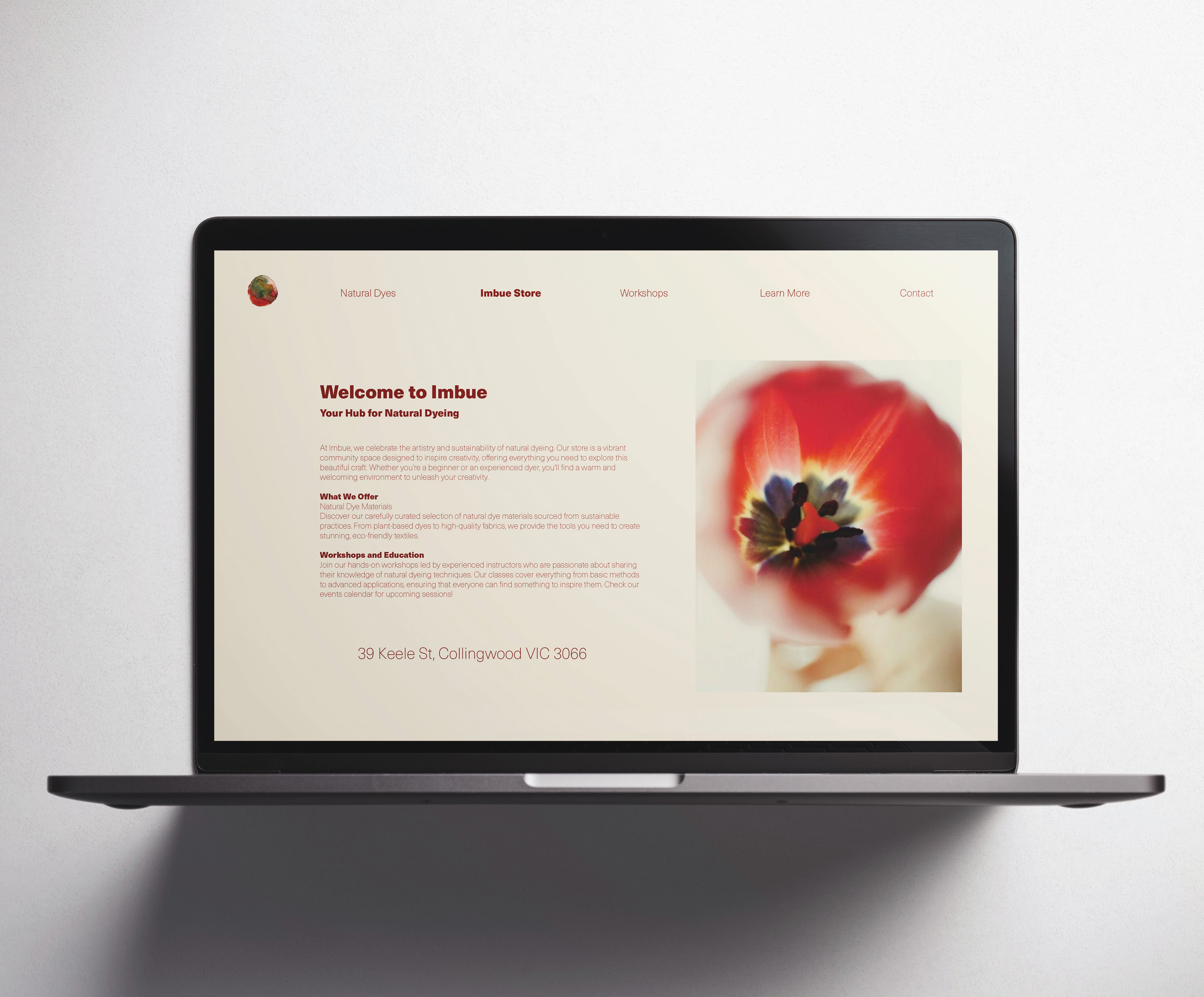
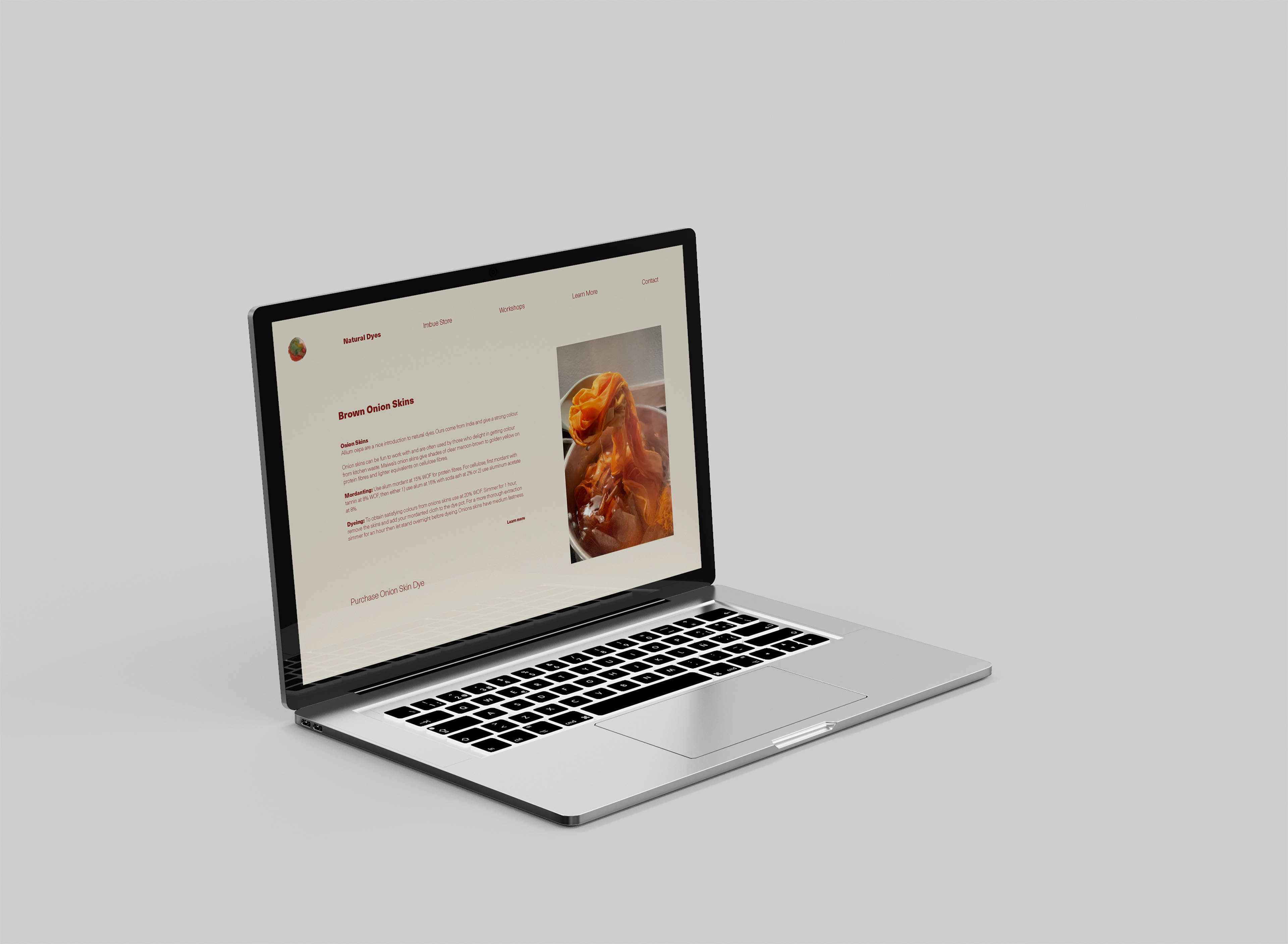
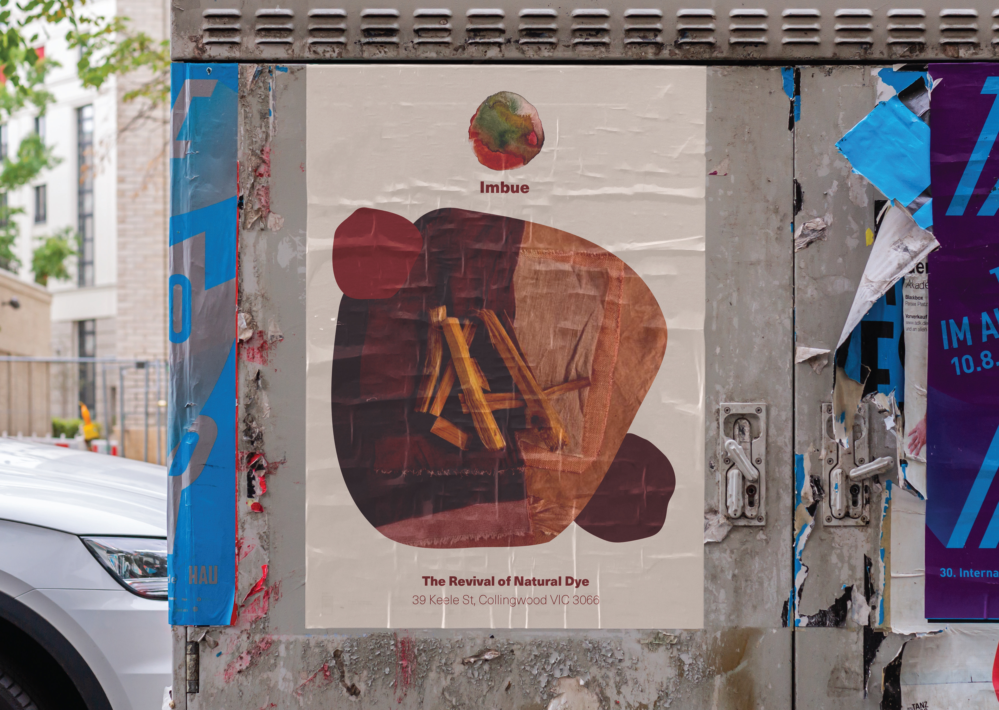
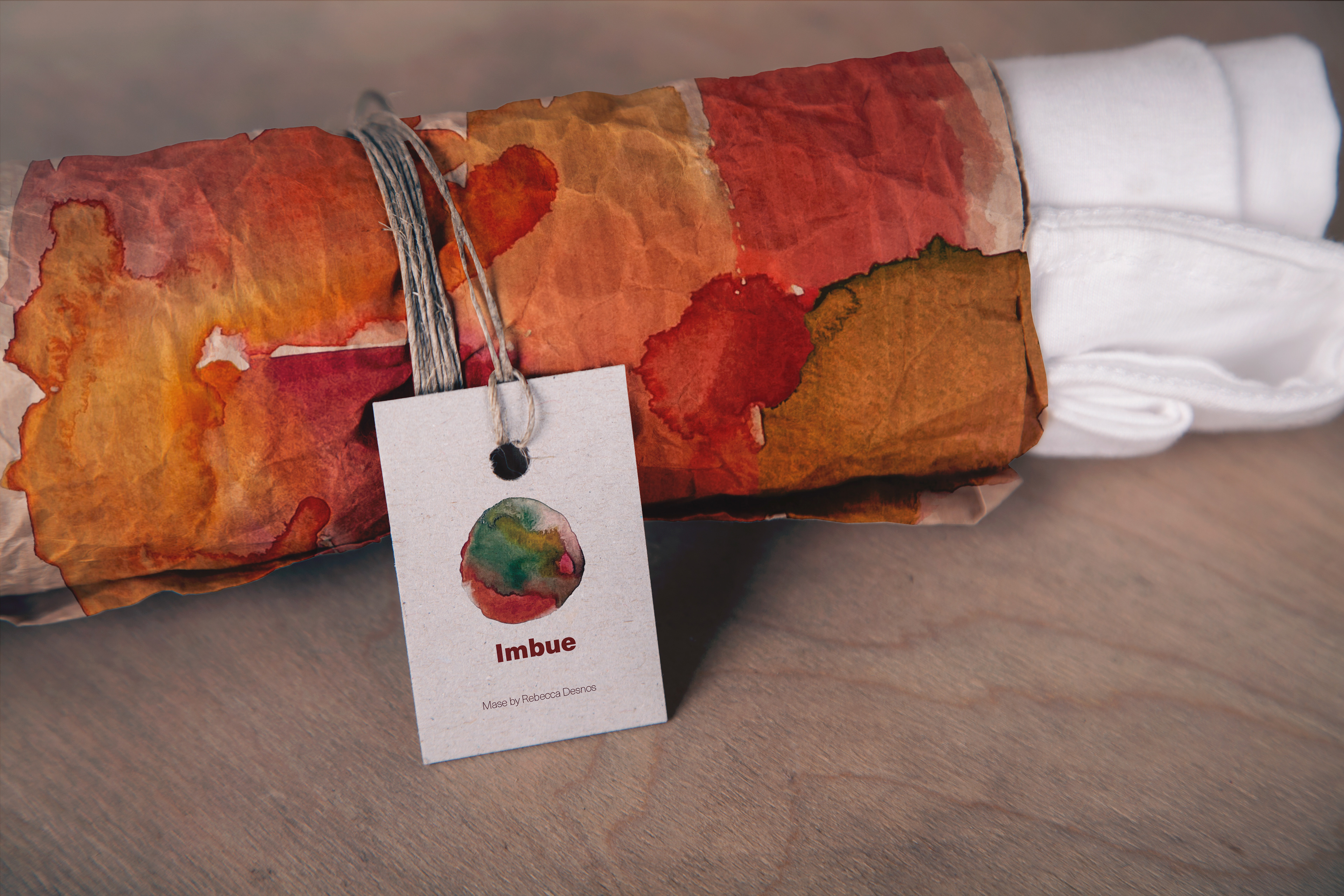
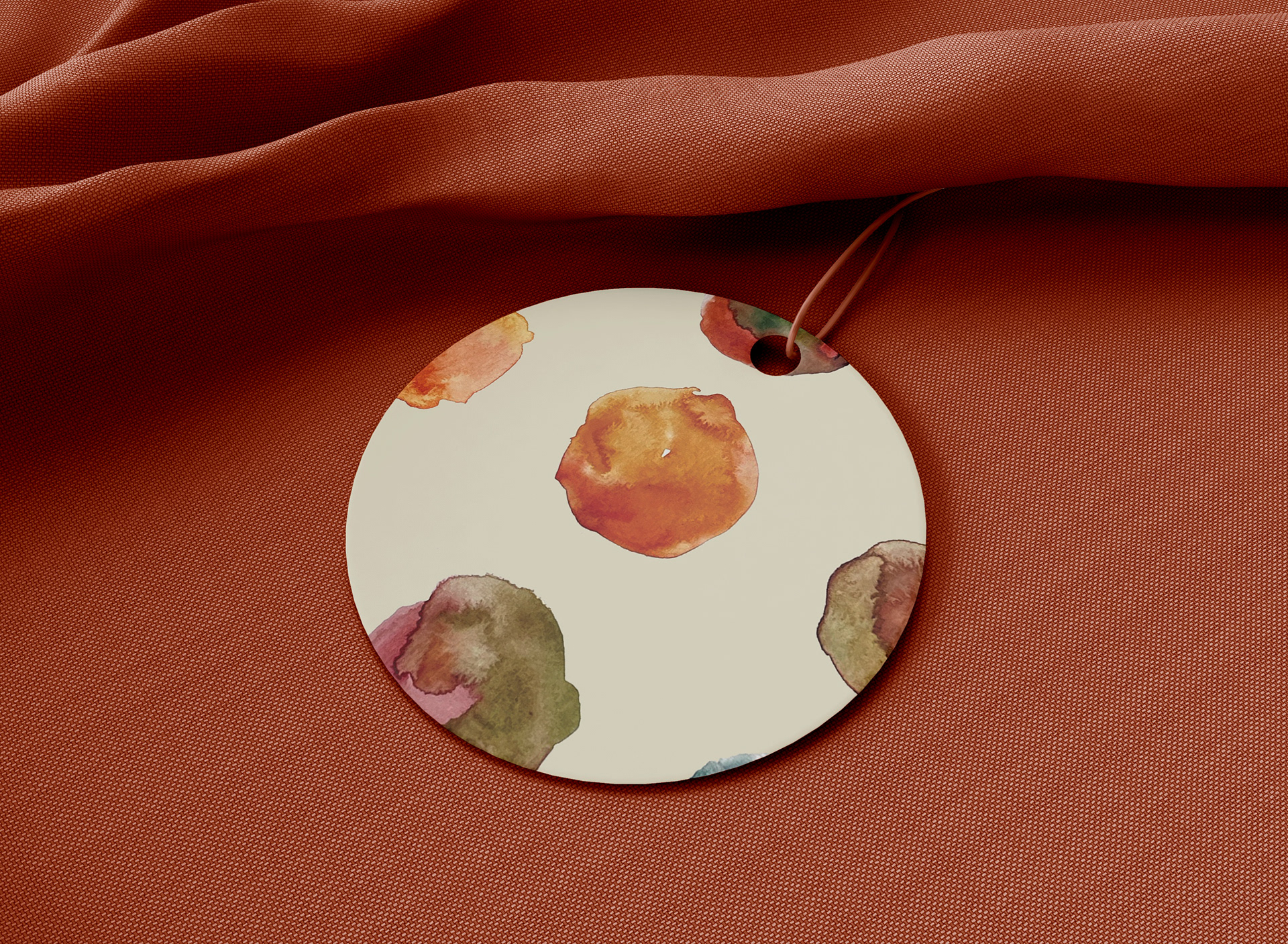
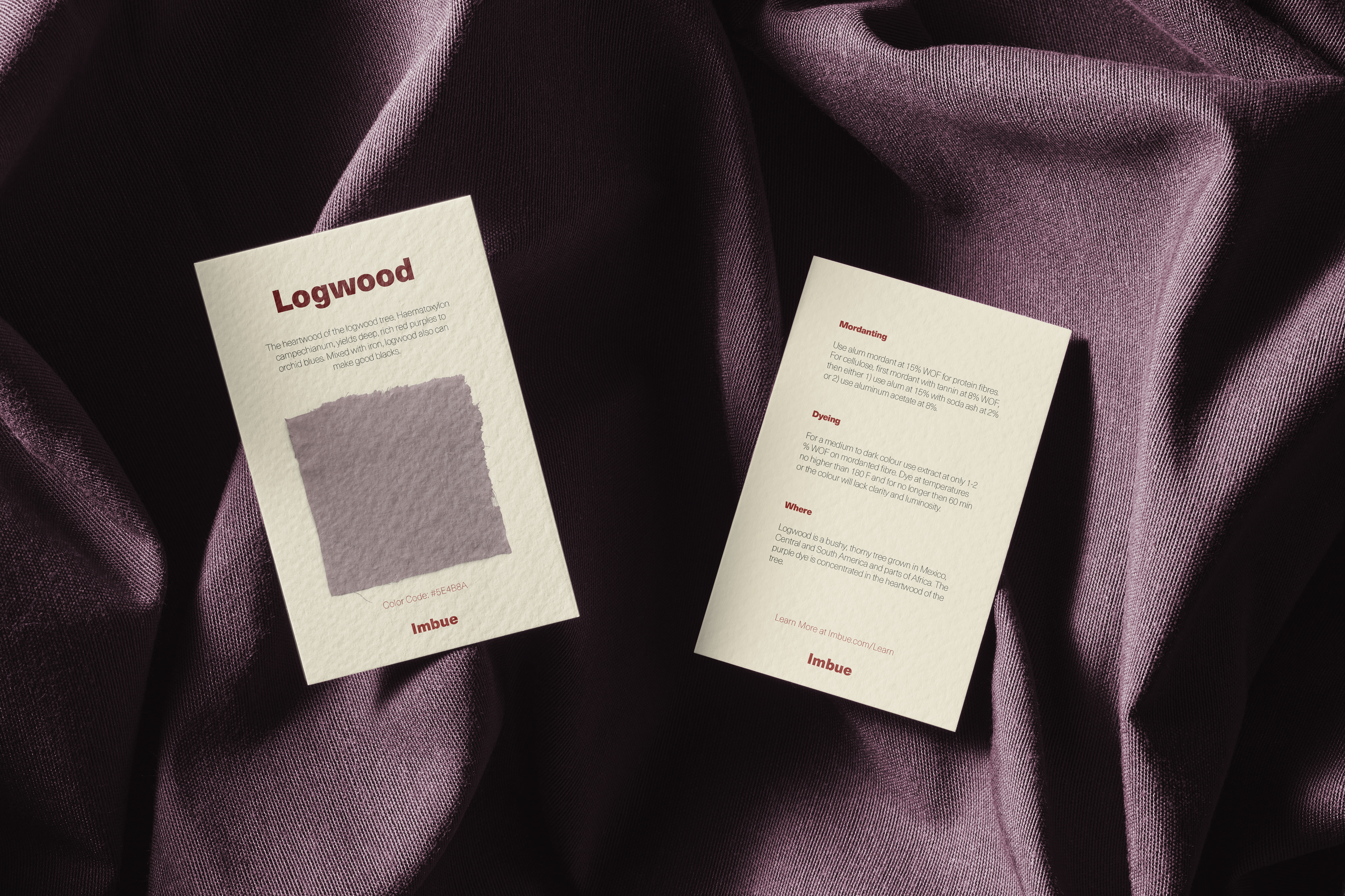
Brand identity package for Imbue, a natural dye store. The visual language reflects Imbue's natural, sustainable and handcrafted identity, using strong symbolism to establish a distinctive brand presence.
Design thinking.
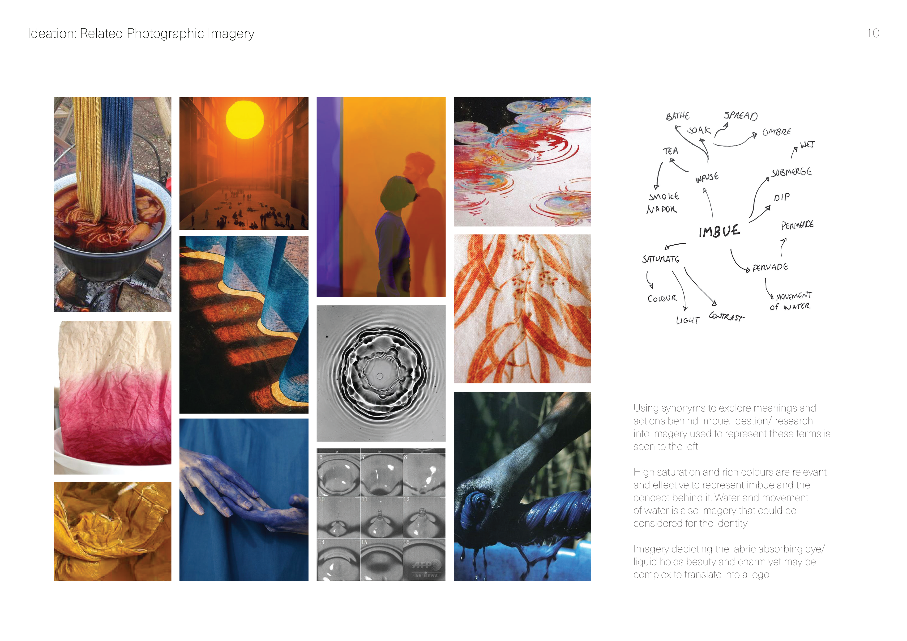
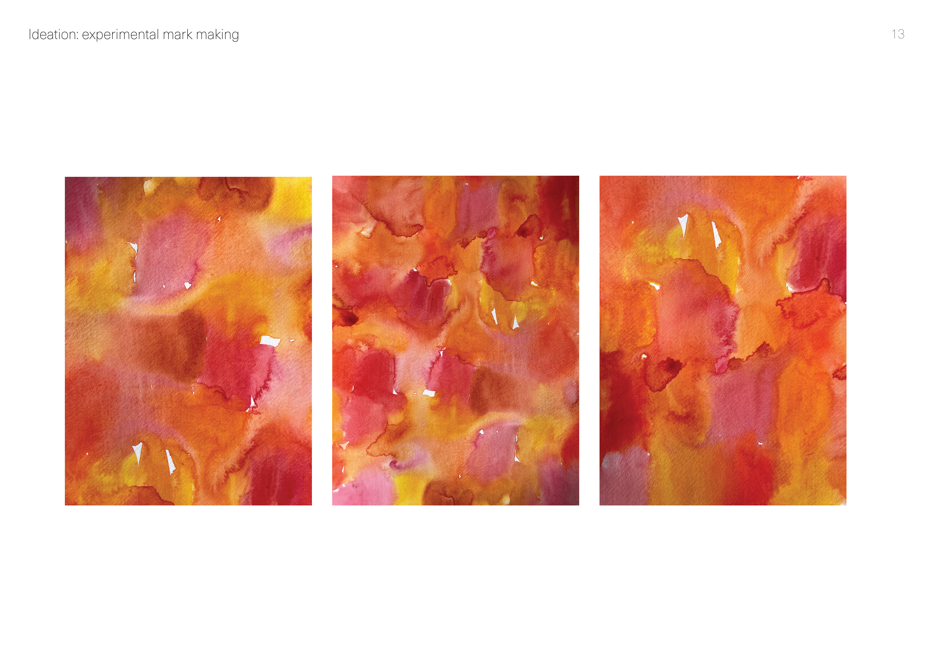
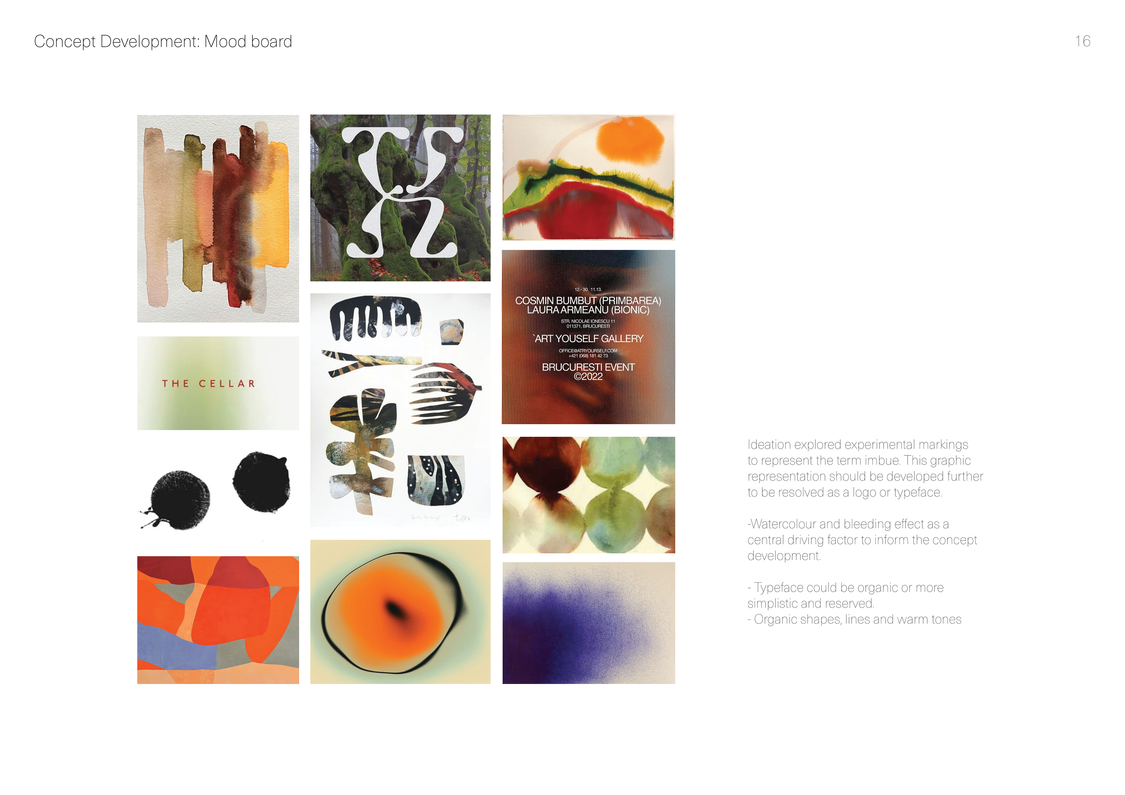
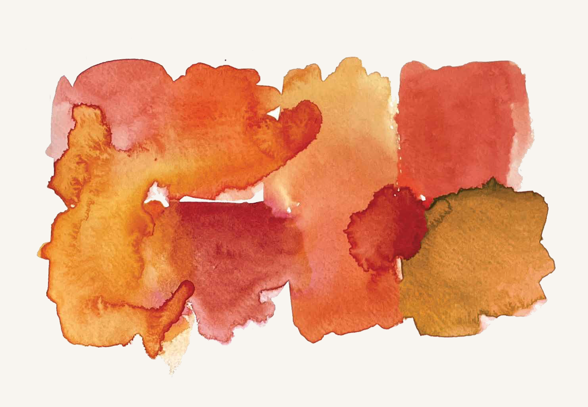
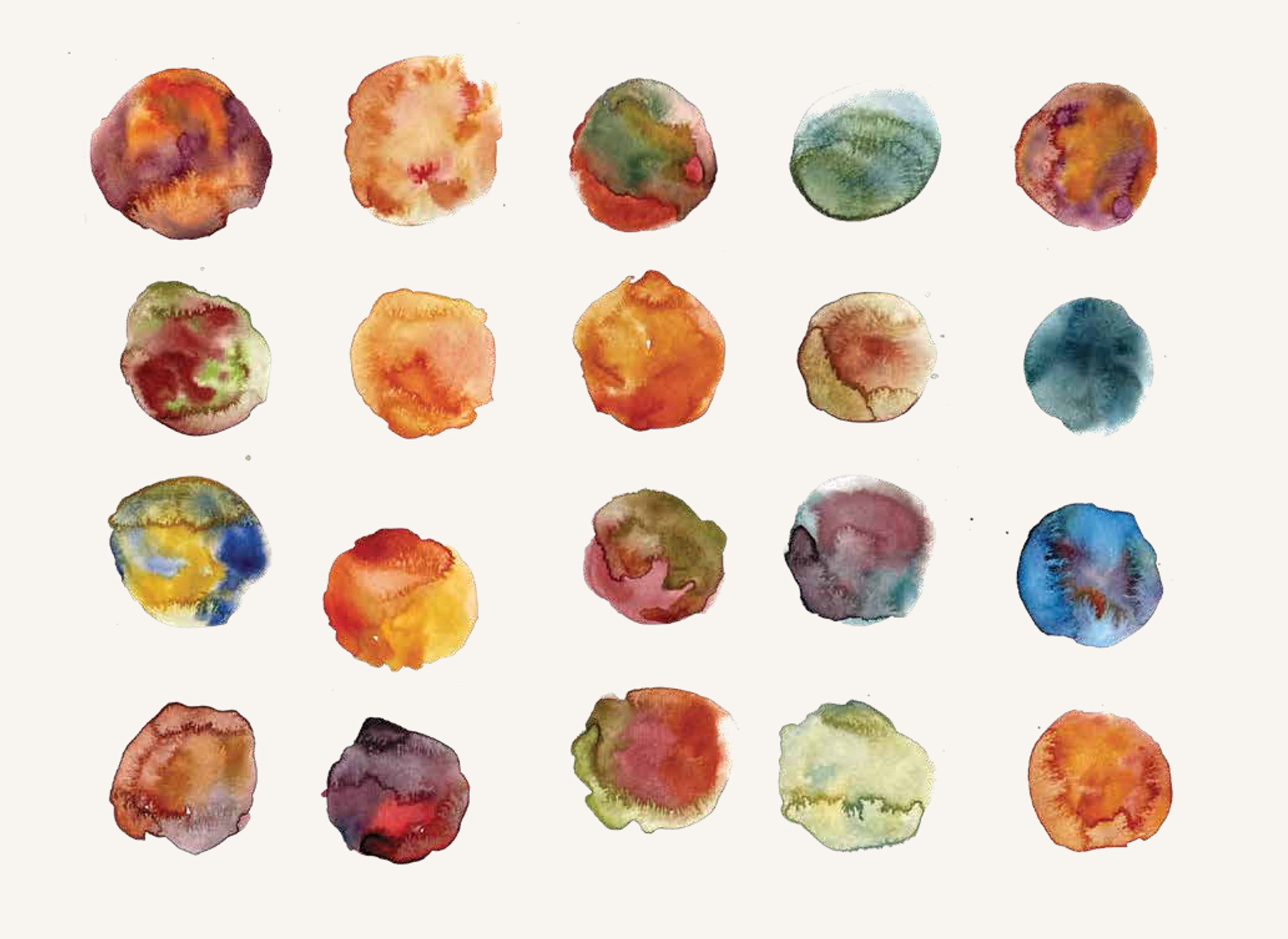
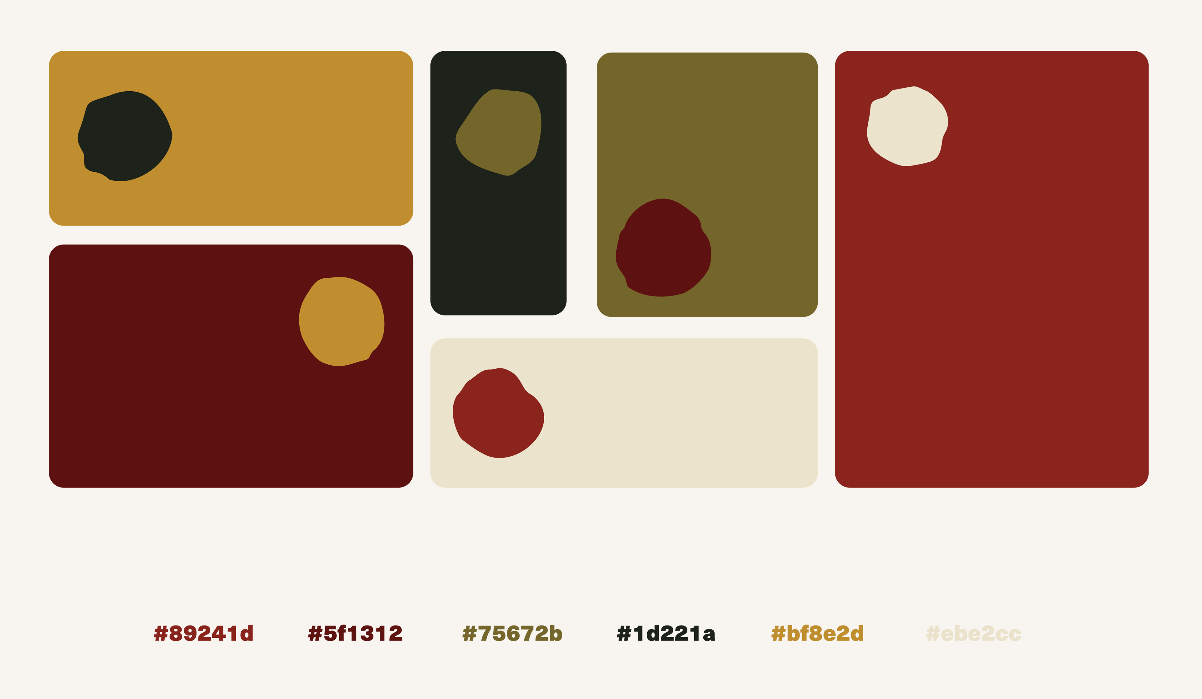
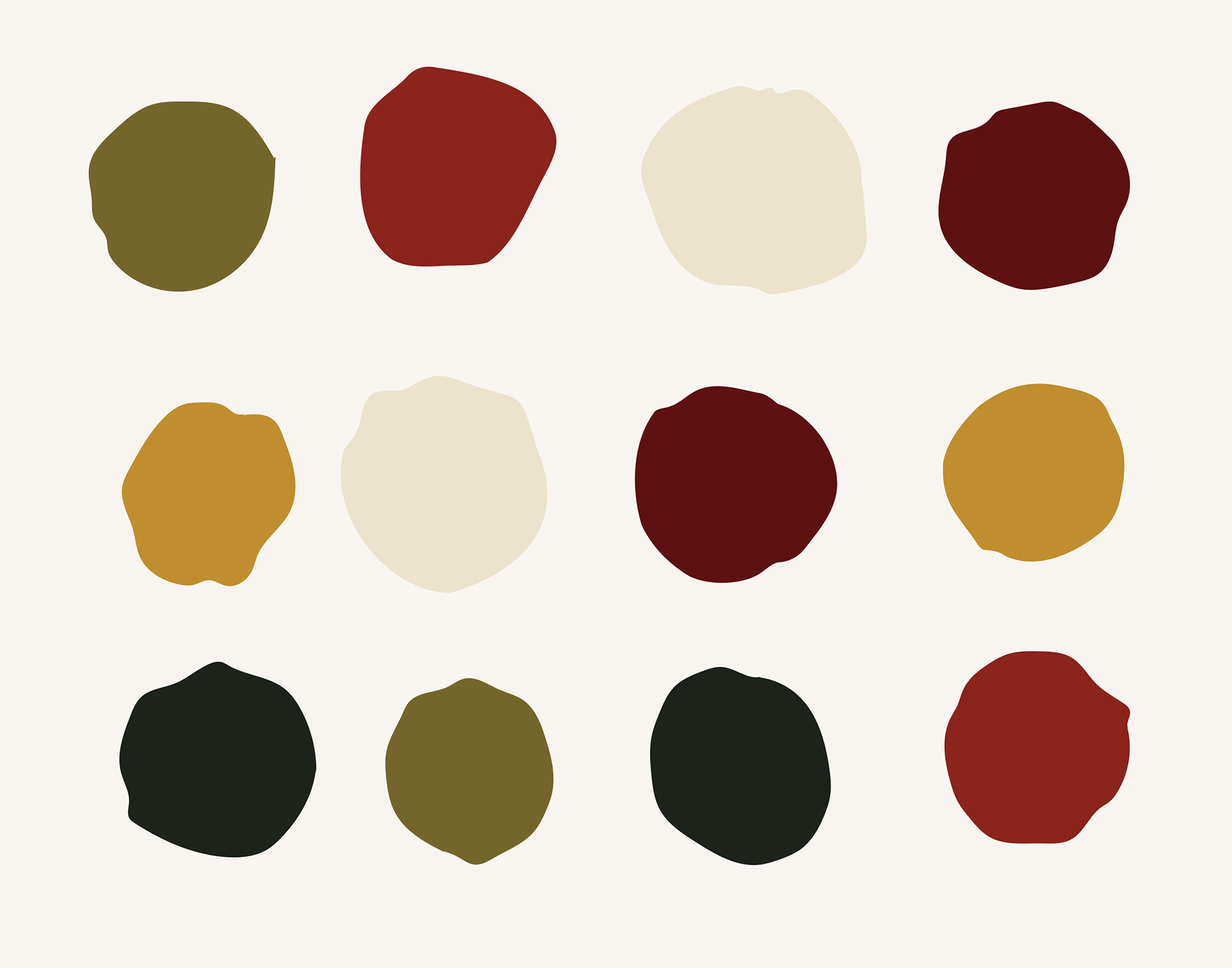
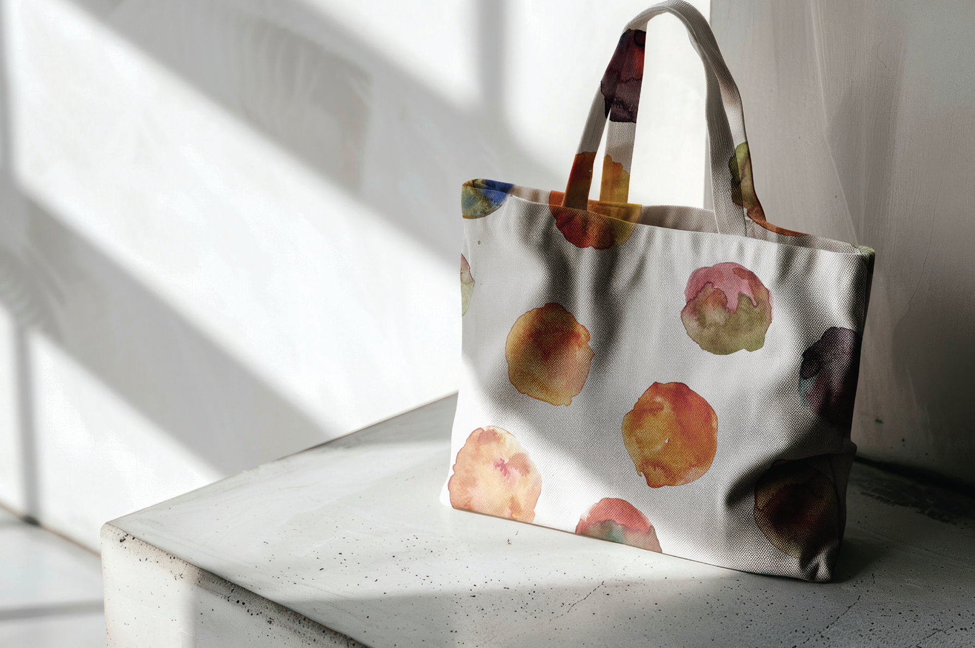
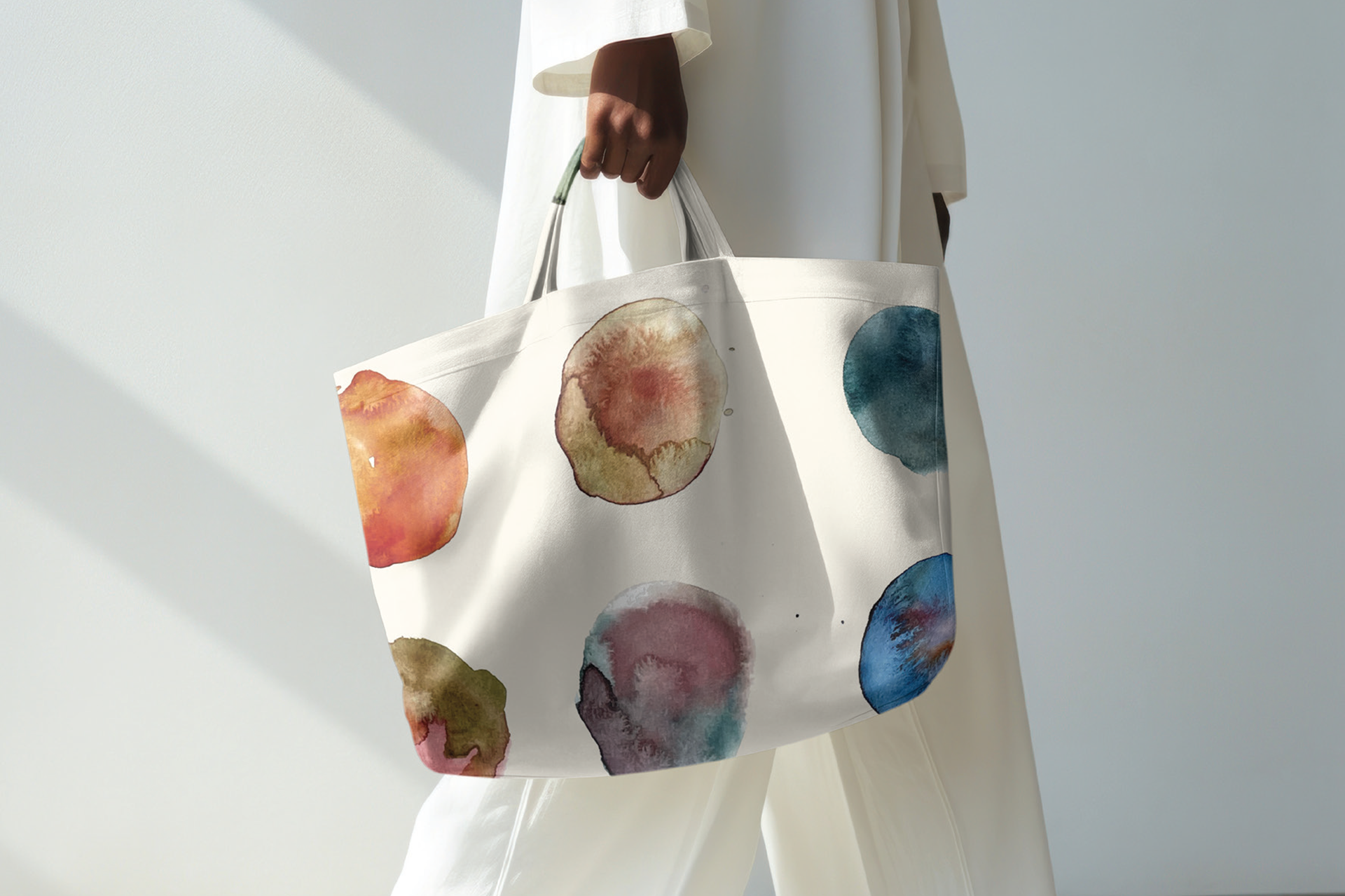
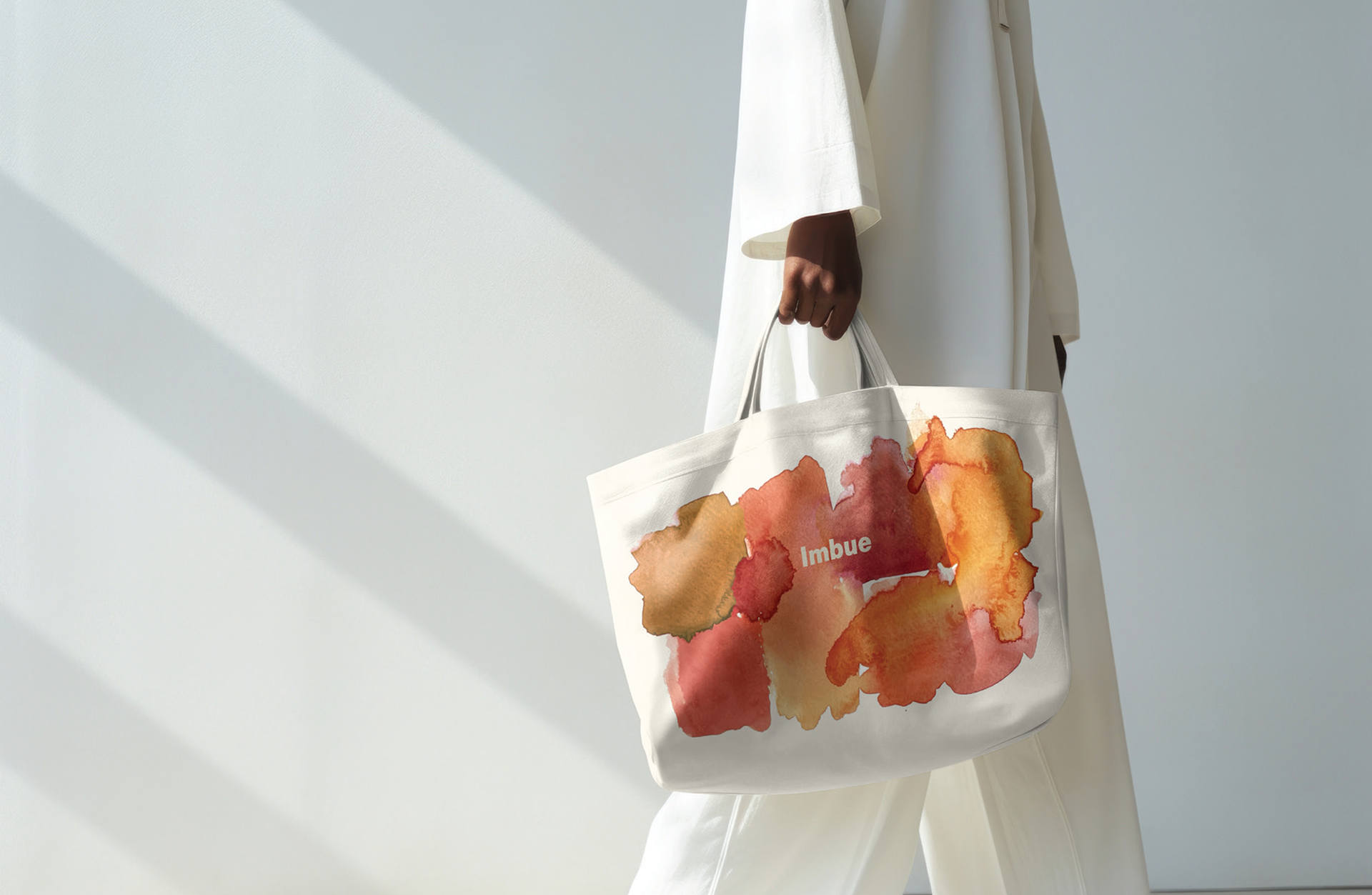
The branding identity is inspired by the meaning of 'imbue,' capturing the feelings and actions of absorption, saturation, and submersion. Texturally and aesthetically, watercolour is used to symbolise these concepts and is implemented in the logo, patterns, packaging and promotional material. The brand mark is created with earthy tones, evoking the natural qualities of raw dye, which the brands colour palette then takes inspiration from. Organic misshapen forms are also used within the visual identity as they represent the odd shapes dye can make when absorbed into a material.
Software: Illustrator, InDesign, Photoshop