

What.
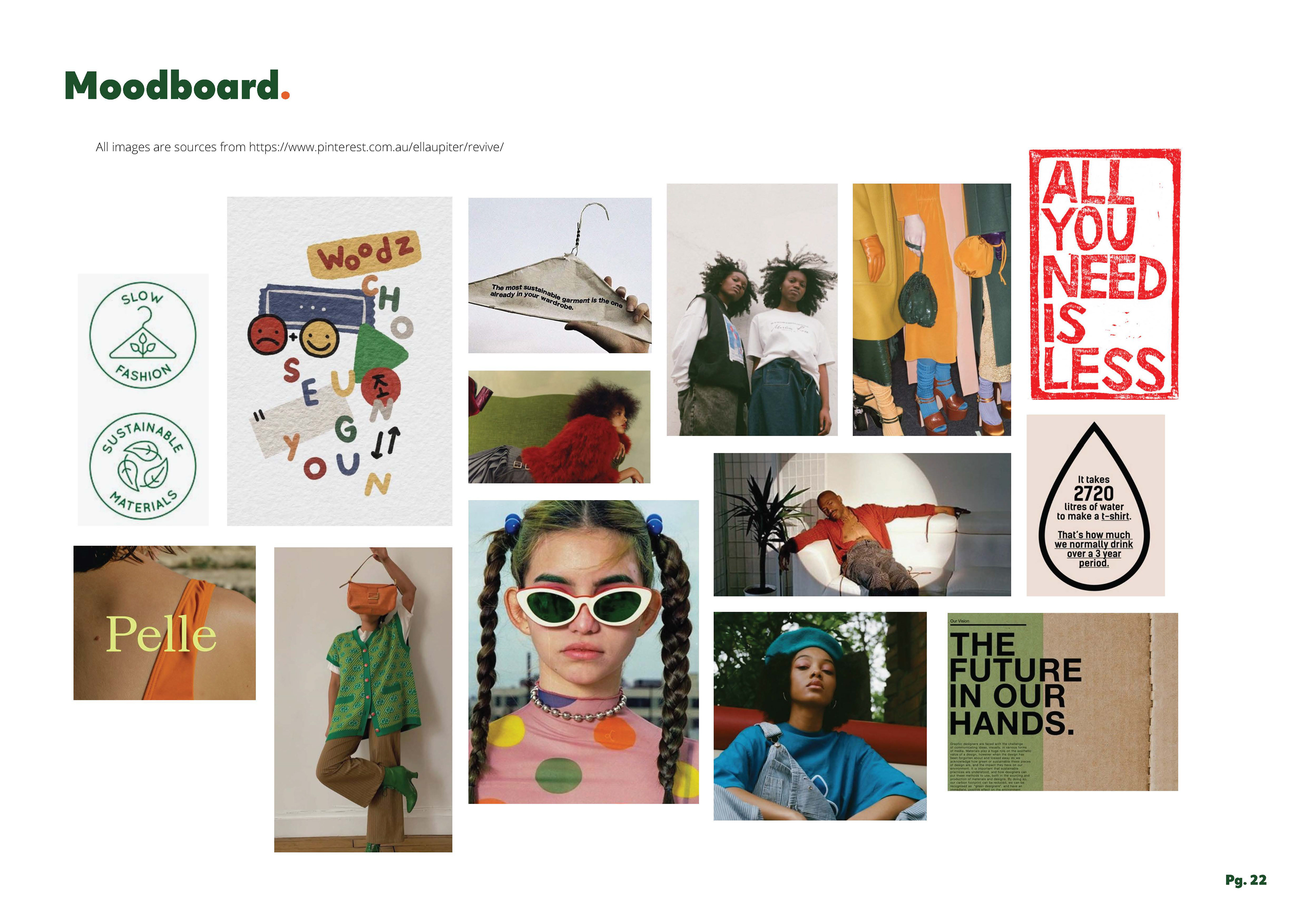
Revive addresses the growing demand for sustainable solutions to the challenges of our modern world. Recognised as a major environmental issue, the fast fashion industry dominates the market for affordable, youth-oriented clothing. Revive seeks to challenge this dominance by offering a vibrant, energetic brand committed to fighting against fast fashion. 
Design thinking.
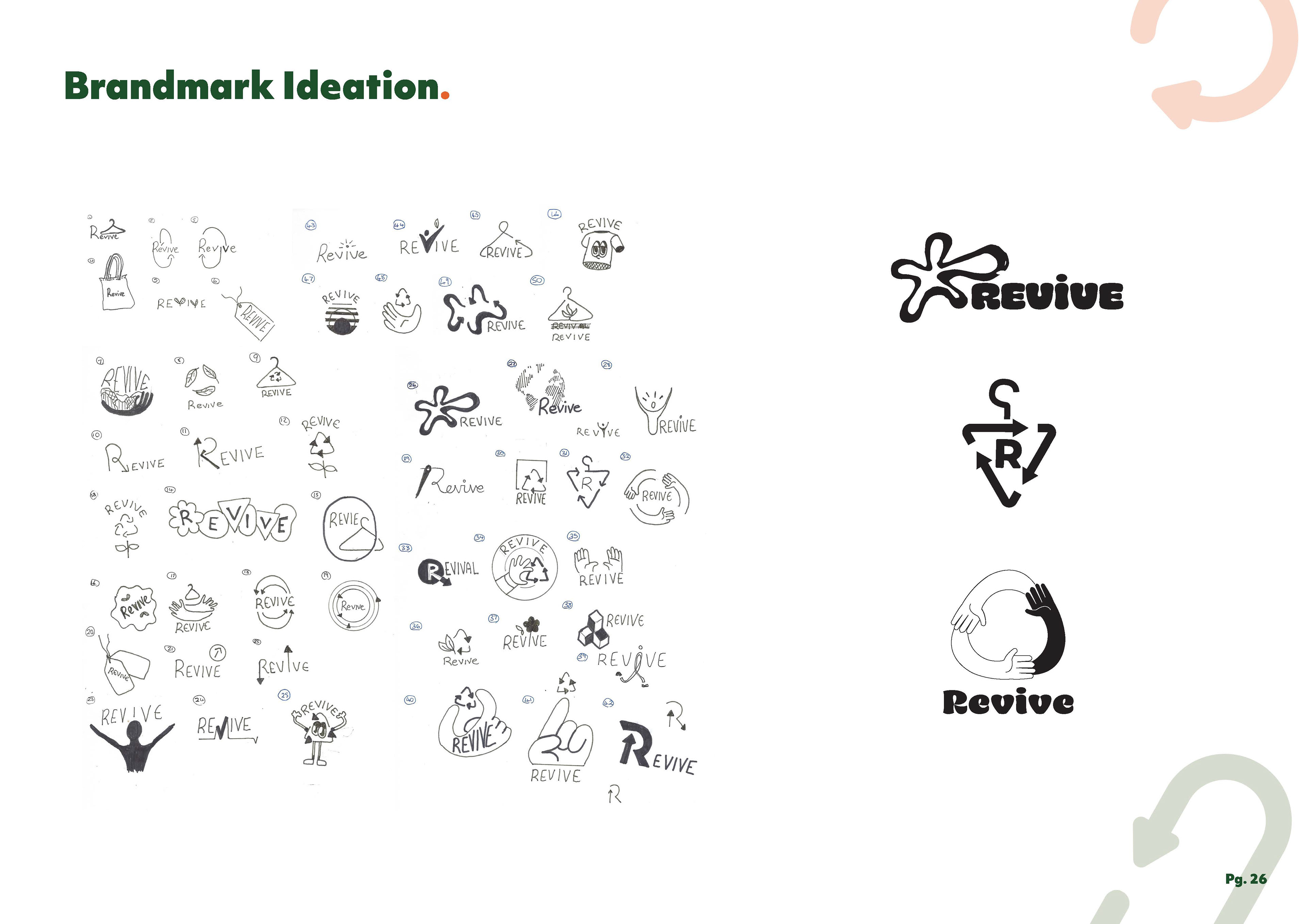
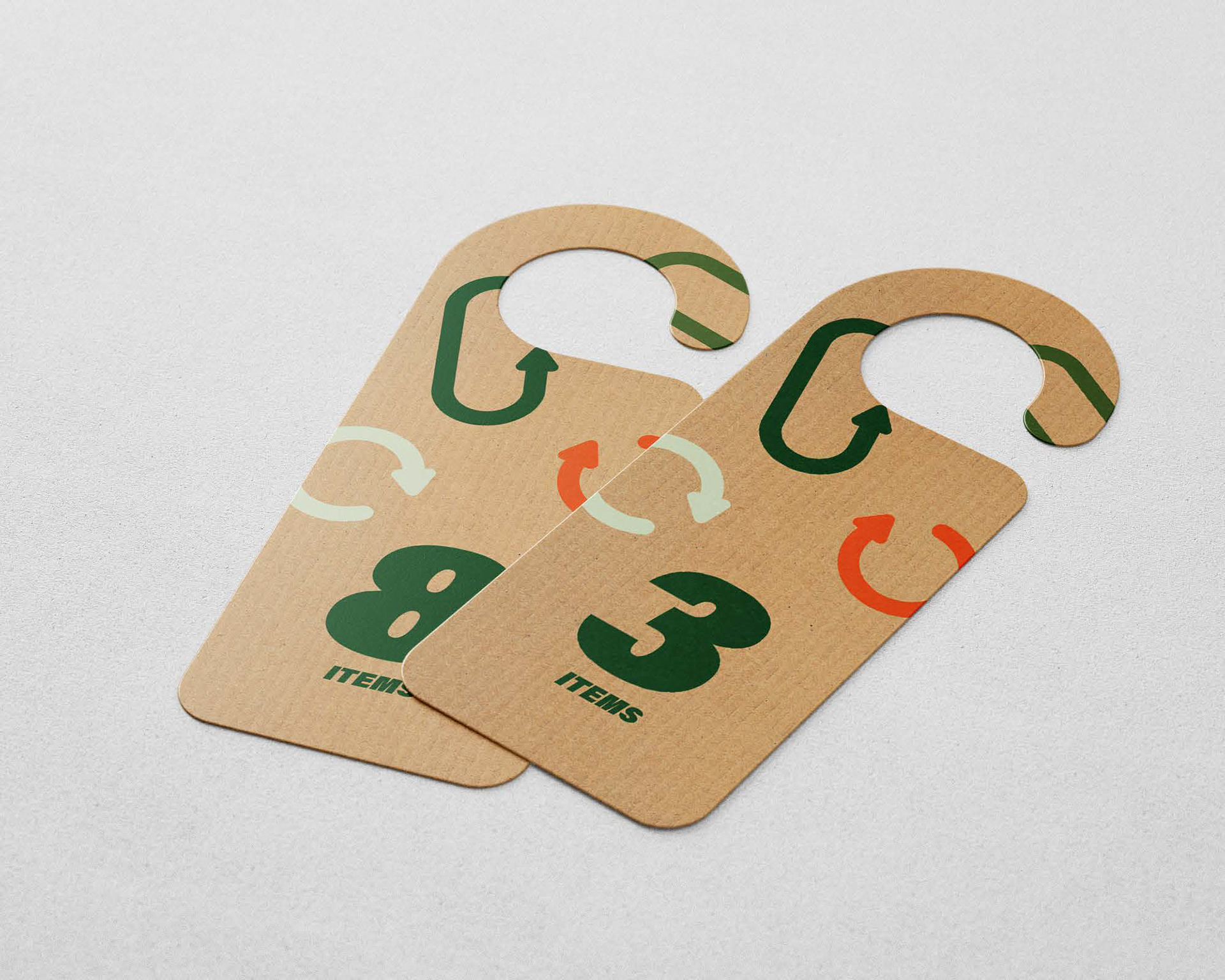
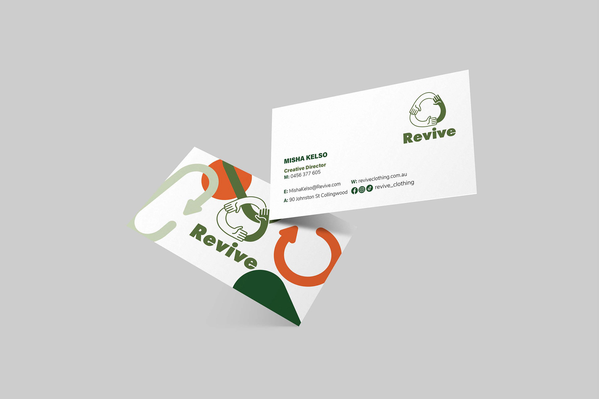
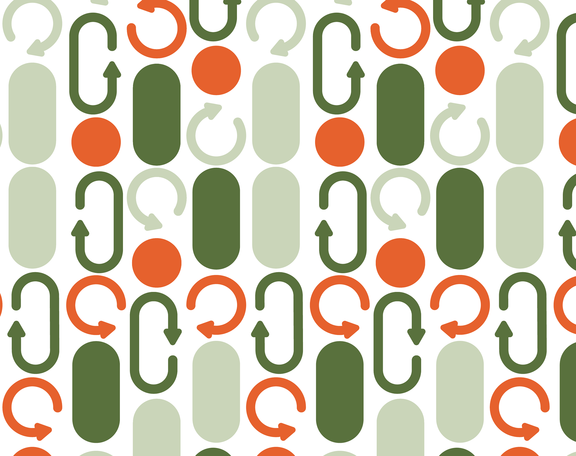
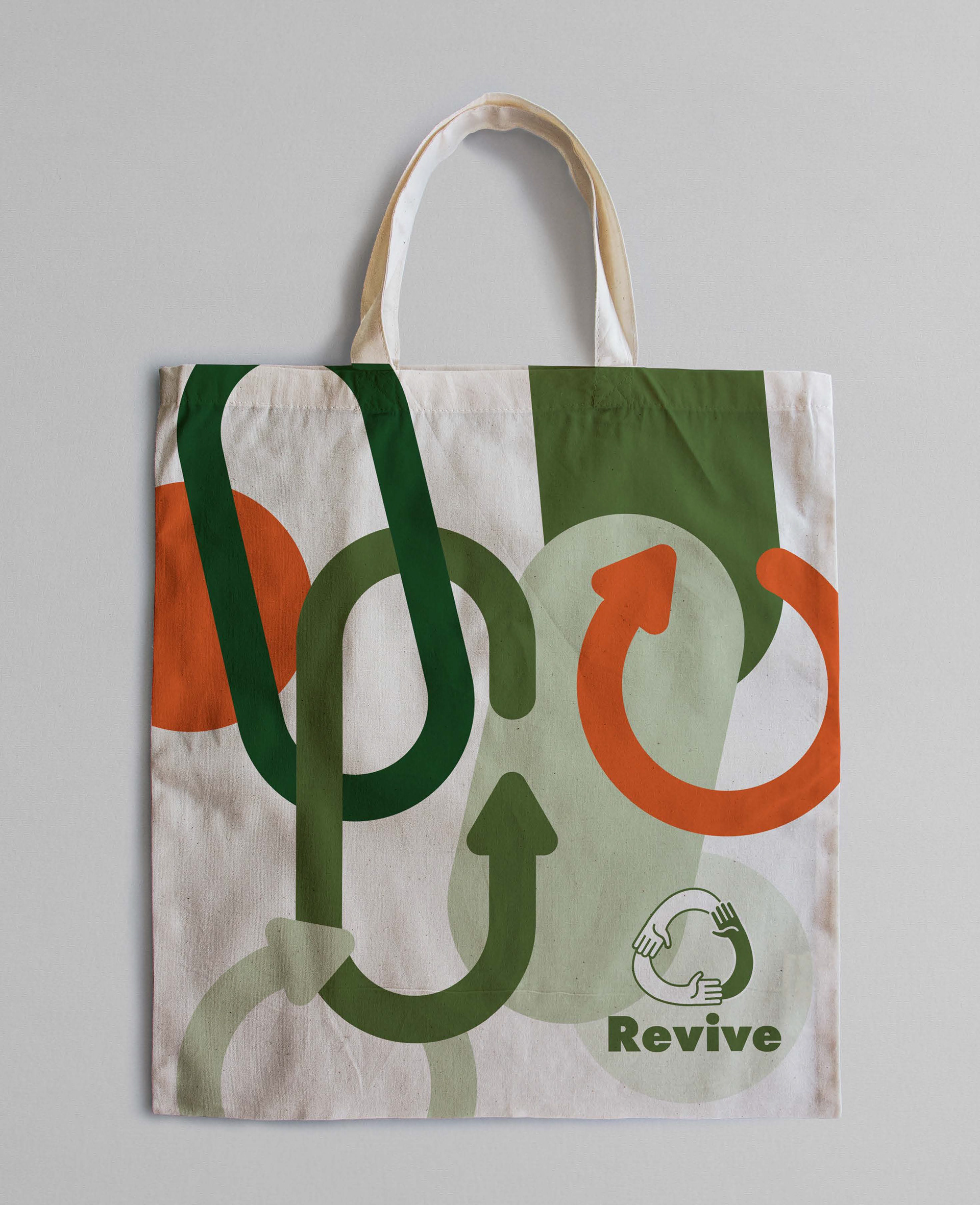
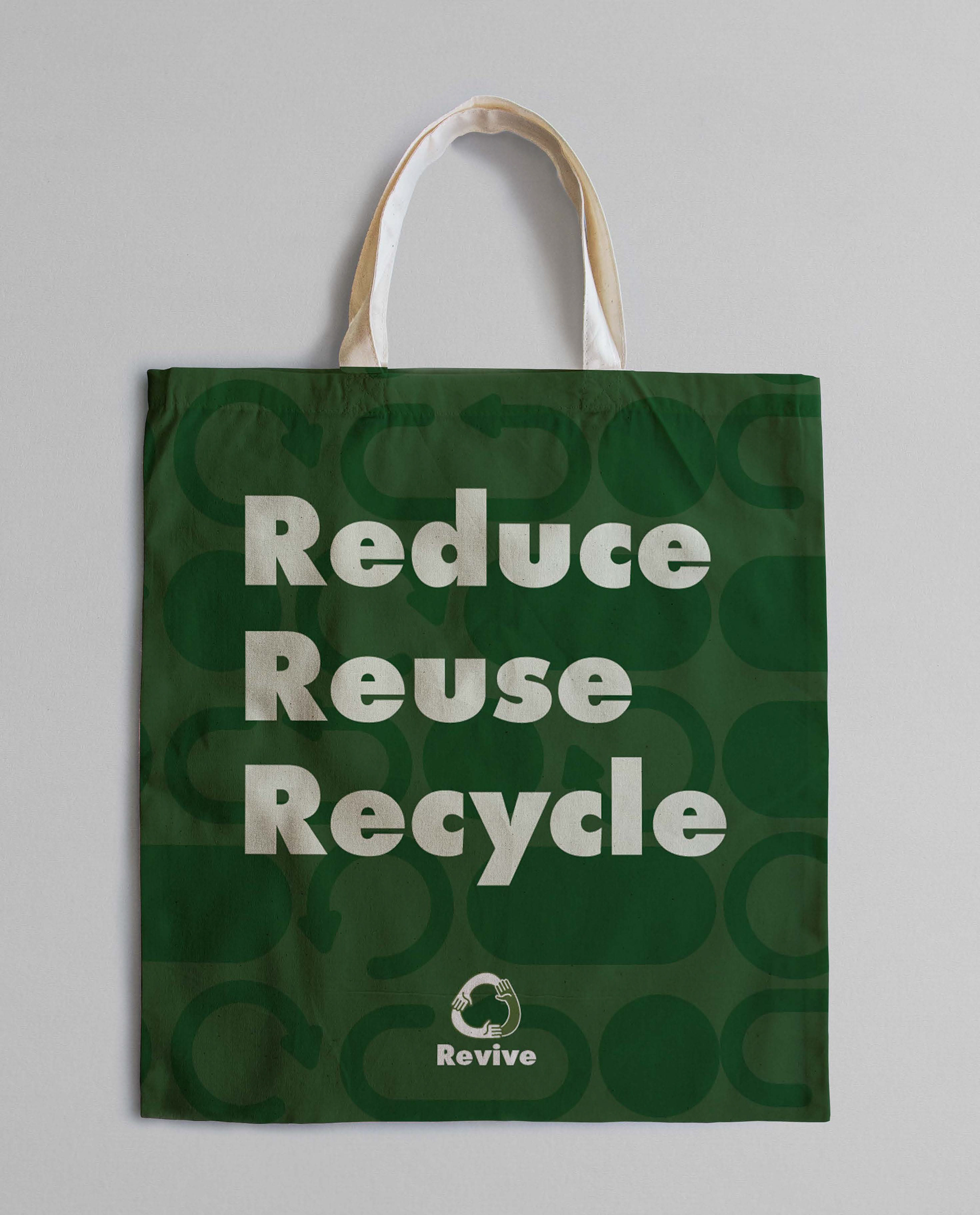
Reviving the traditional recycling symbol within the brand identity, the directional arrows represent the collection, repurposing, and reuse of goods—specifically clothing in the case of Revive. By reinvigorating this familiar icon in various way throughout the visual identity, Revive leverages its widespread recognisability to build a strong brand identity.
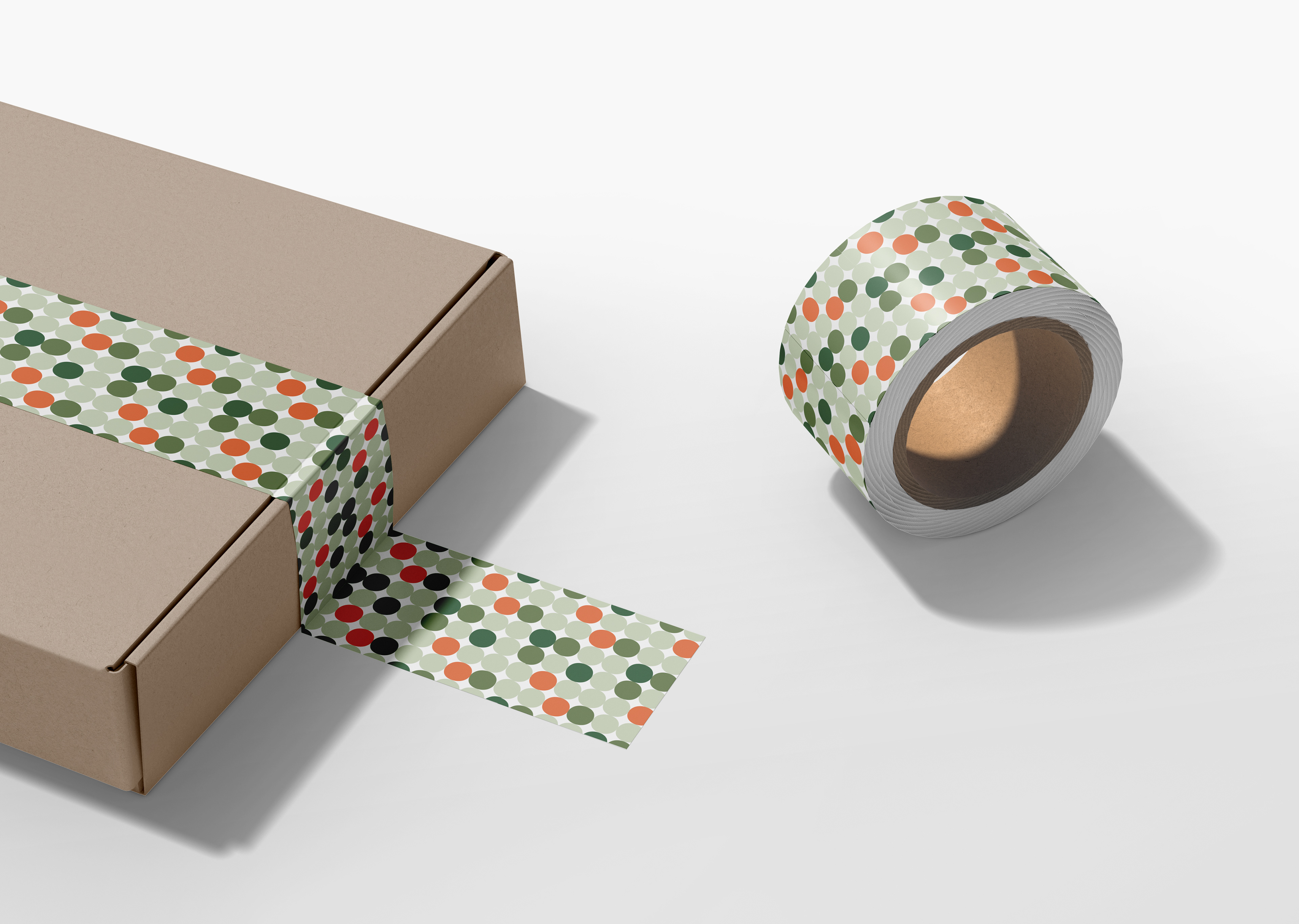
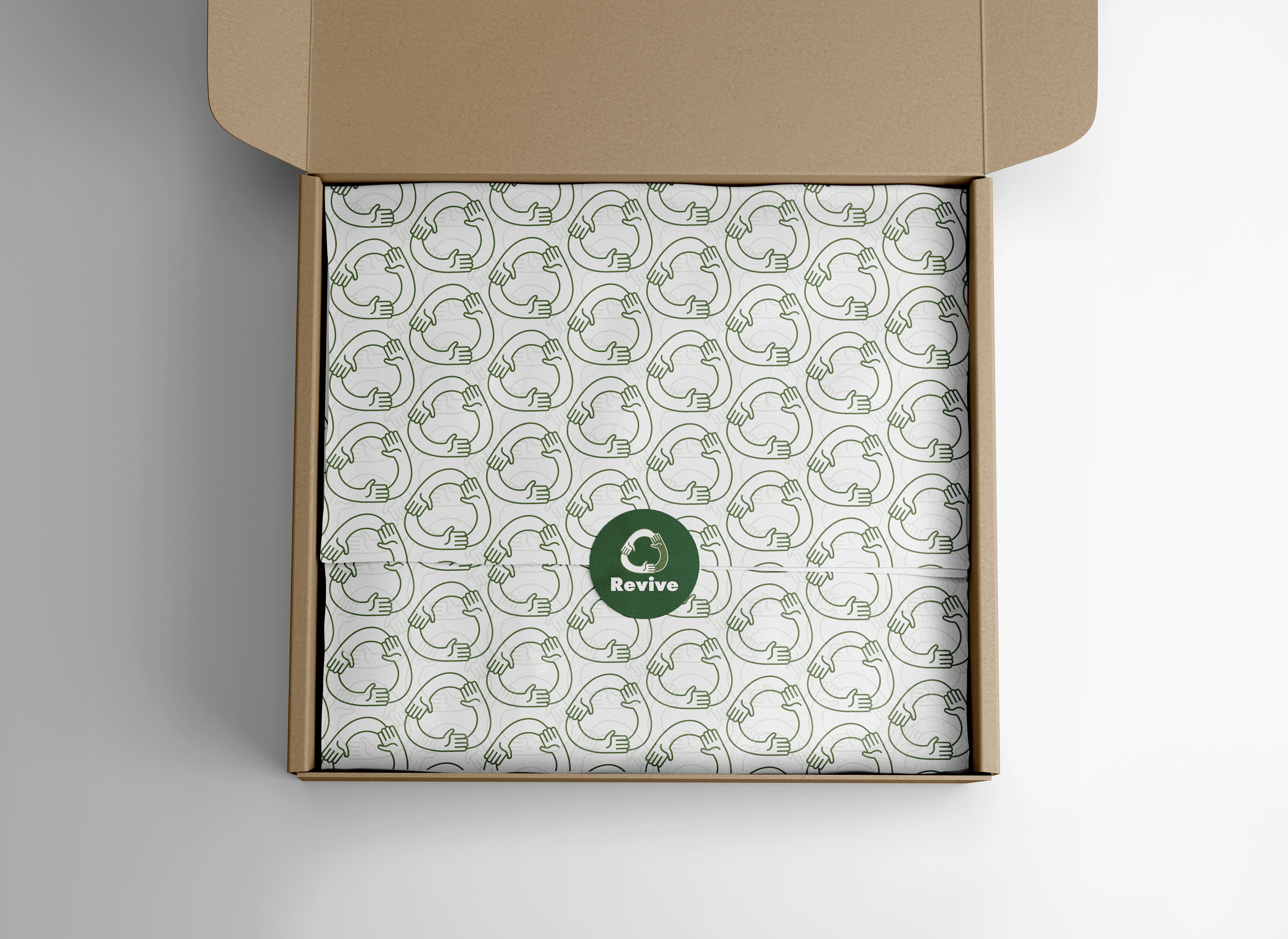
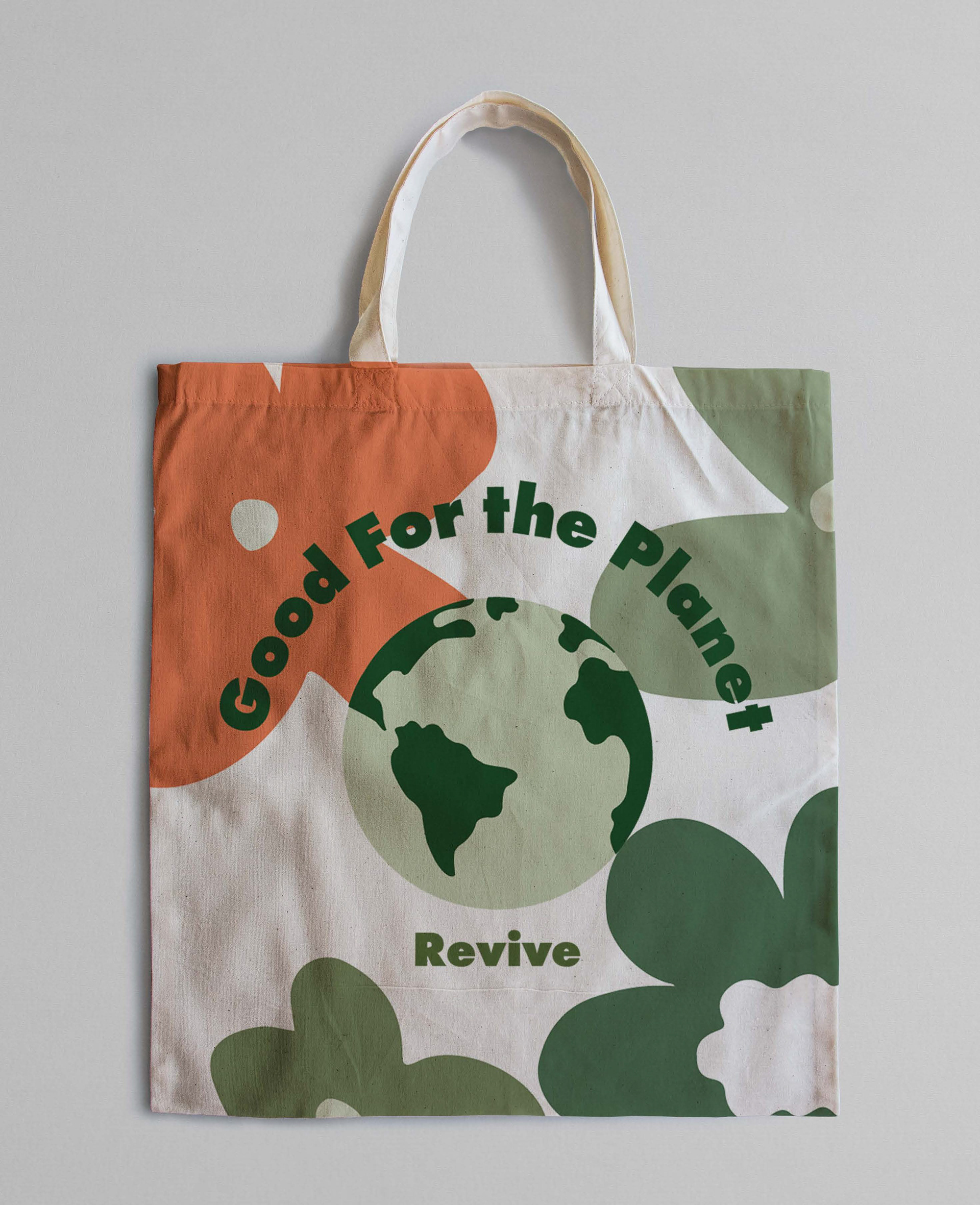
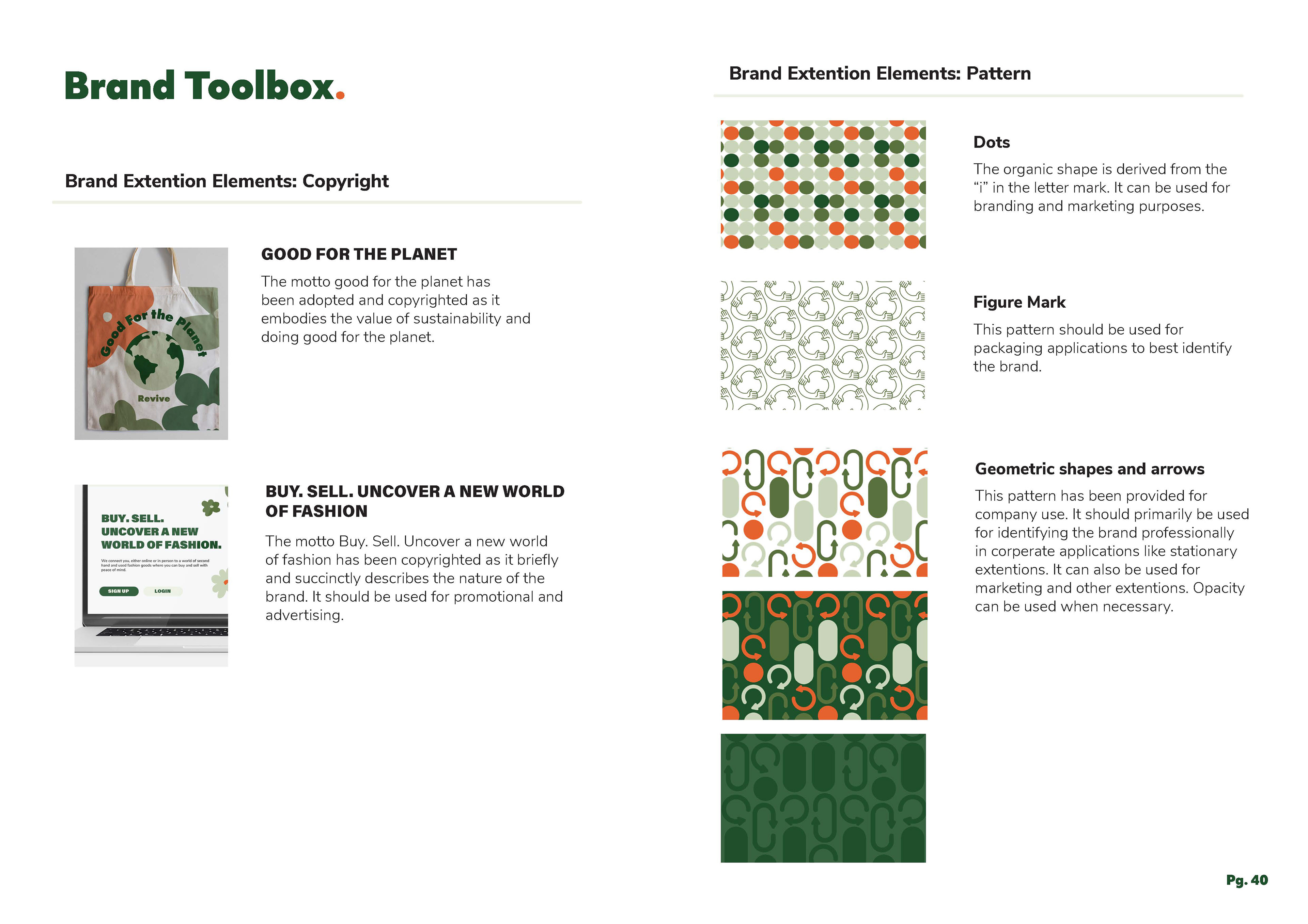
The logo reimagines the symbol by incorporating hands, symbolising the community and human action needed to drive Revive’s mission of creating a sustainable clothing store. Another visual element inspired by the traditional recycling symbol is the use of simple geometric shapes with directional arrows, featured throughout the brand extensions to create clean, eye-catching graphics. This design effectively balances a modern, minimalist feel with a touch of youthfulness and vibrancy—where the colours are playful, yet the shapes remain simple. 
Ultimately,  these elements combine to create a distinctive and engaging visual identity that reflects Revive’s commitment to sustainability, community, and a fresh approach to fashion.
Software: Illustrator, InDesign, Photoshop
Back to Top