Skera, meaning cut in danish is a brand that produces well made secateurs. Skera has a unique customer audience who sees value in well made gardening products.


What.
Skera was created to offer reliable, well-crafted products. Integrity and quality are key, with copper used in the tools for its durability and ability to promote plant growth.
DESIGN THINKING.
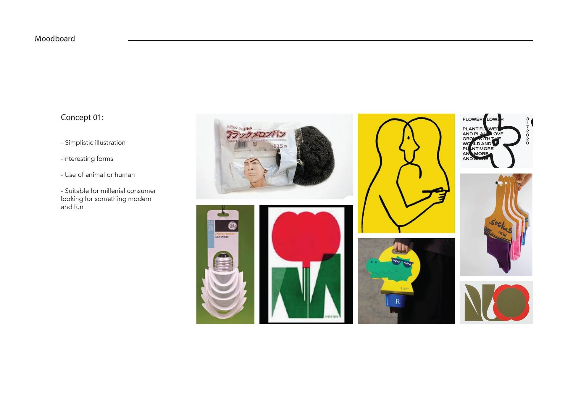
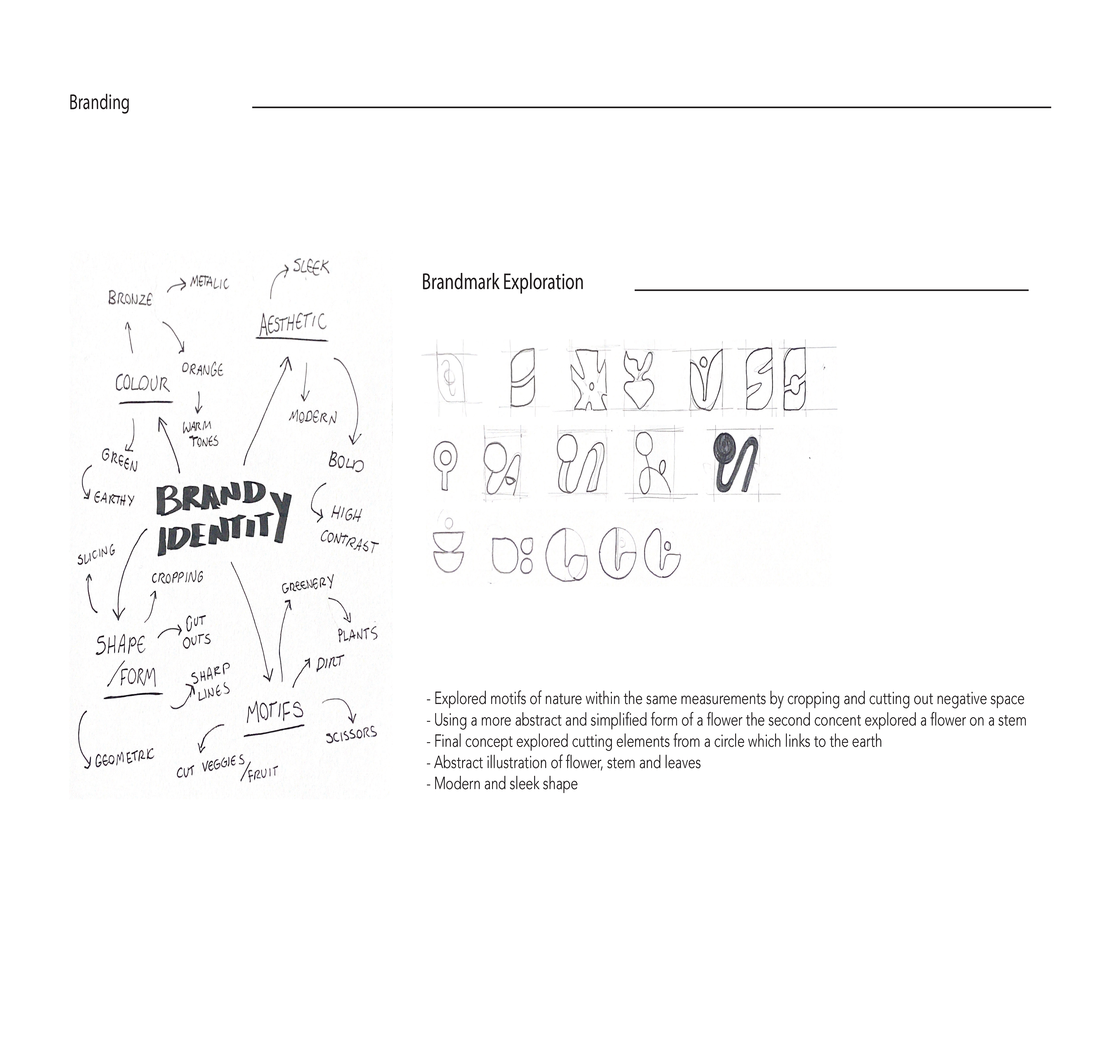
The brand’s signature orange is inspired by the warm, natural hue of copper. This vibrant colour is paired with a soft yellow, symbolising the sun’s nourishing rays. The logo’s organic shapes evoke the image of a budding flower, stem, and leaf, while the 'cut-up' design pattern, derived from slicing elements of the logo, reflects the function of secateurs—a tool designed for cutting. This creates a direct, meaningful connection between the product and the brand's visual identity.
Visually, Skera’s brand is cohesive, energised, and modern. The colours and organic shapes balance playfulness with sophistication, while reflecting the brand’s commitment to craftsmanship, sustainability, and innovation.
Software: Illustrator, InDesign, Photoshop